The following blog by Brian Moore was originally published on Do Mo(o)re With Data January 2, 2022 and is cross-posted here with permission. Brian is a Tableau Ambassador and a Senior Data Analytics and Viz Consultant for Cleartelligence.
This is part two of a three-part series on creating curved elements in Tableau. Although this post covers new and different techniques, I would recommend checking out part one of the series here as some of the concepts overlap. This post will focus on one type of curved line that is used frequently in Tableau Public visualizations; Bezier Curves. To follow along, you can download the sample data here, and the sample workbook here.

Bezier Curves
There are many types of Bezier curves varying in complexity from very simple to ridiculously complicated. One commonality with these types of curves is that they rely on ‘control points’. This post is going to focus on quadratic Bezier curves, which have 3 control points. An easy way to think about these points is that there is a starting point, a mid point, and an end point, creating a triangle. The starting point and end point are simply the start and end of the line. The other point, the mid point, will determine the shape of the triangle, and in turn, what that curve is going to look like. Now let’s see how the position of that mid point (creating different types of triangles) will affect the curve.
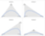
Each of the triangles above have the same starting point (1,0) and the same end point (10,0), but have significantly different curves because of the varying mid point. For most applications in Tableau we’re going to be dealing with examples like Example 1 and Example 4 in the image above, where the mid point is halfway between the other points, creating an isosceles triangle. To make things even easier for this example, we’re going to deal with just Example 1, which is an equilateral triangle, meaning all 3 sides are the same length.
Building Your Data Source
To build our data source we are going to follow the same process that we did in Part 1 of this series. We are going to create additional points by joining our sample data to a densification table using join calculations (value of 1 on each side of the join). In this case, our sample data is called Bezier_SampleData and our densification data is called BezierModel. You can download the sample data here. In our sample data we have 10 records that we’ll use to draw 10 unique curves. For simplicity sake, all of these curves will start and end at 0 on the Y axis.

Building Your Calculations
To draw our curves there are a few things we’ll need to calculate. Our sample data has 2 of the 3 points we need (starting point and end point), so we’ll need to calculate the X and Y values for the 3rd point (mid point). Let’s start there.
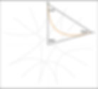
We discussed above that we are going to use equilateral triangles to draw our curves. In that case, the X value for the mid-point will be halfway between [X_Start] and [X_End] and the Y value will be the height of the triangle plus the starting point. Here is an example:

To find the X value that falls in the middle of [X_Start] and [X_End], just add them together and divide by 2
X_Mid
([X_Start]+[X_End)/2
To find the Y Value add the Y starting point to the height of the triangle. To find the height of the triangle, use the formula (h=a*√3/2) where a is the length of one of the sides of your equilateral triangle. To find that length subtract [X_Start] from [X_End]
Y_Mid
[Y_Start] + (([X End]-[X Start])*SQRT(3)/2)
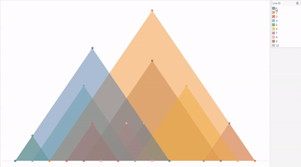
Now, we have 3 points for each record in our data set. We have our starting point ([X_Start],[Y_Start]), our end point ([X_End],[Y_End]), and our mid point ([X_Mid],[Y_Mid]). If we were to stop here and plot those points, it would look something like this, 10 equilateral triangles of different sizes, all on the Y axis (because we had used 0 for all of the [Y_Start] and [Y_End] values)
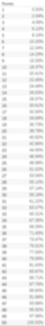
Now let’s convert those points into Bezier curves. The first calculation we’ll need is [T]. T is going to be a percentage value that is equally spaced between 0 and 1 for the number of points in our densification table. Think of this as similar to the [Position] calc in Part 1 of this series, but slightly different because we need our first point to start at 0.
T
([Points]-1)/{MAX([Points])-1}
No matter how many points you add to your densification table, this calculation will spread them evenly between 0 and 1. This field is used to evenly space our points along our curved line. When complete, your T values should look like this. The value for point 1 should be 0%, the value for the last point should 100% and all of the points in the middle should be equally spaced between those
Now all that is left is to calculate the X and Y coordinates for each point along our curved lines. The calculations for X and Y are exactly the same, but in the [Bezier_X] calc you are using the 3 X values, and in the [Bezier_Y] calc you are using the 3 Y values
Bezier_X
((1-[T])(1-[T])[X_Start] + 2(1-[T])[T][X_Mid]+[T][T]*[X_End])
Bezier_Y
((1-[T])(1-[T])[Y_Start] + 2(1-[T])[T][Y_Mid]+[T][T]*[Y_End])
Now let’s build the curves in Tableau.
Build Your Curves
Follow the steps below to build your curves
Right click on the [Bezier_X] field, drag it to columns, and when prompted, choose the top option ‘X’ without aggregation
Right click on the [Bezier_Y] field, drag it to rows, and when prompted, choose the top option ‘Y’ without aggregation
Change the Mark Type to ‘Line’
Right click on the [Points] field, drag it to Path, and when prompted, choose the top option ‘Points’ without aggregation
This tells Tableau what order to ‘connect the dots’ in.
Drag [Line Name] to color
When you finish, your worksheet should look something like this:

Or you can change the Mark Type to ‘Polygon’ and reduce the Opacity and it will look like this:

Now this is a relatively simple example. You can get really creative with how you calculate those 3 points, especially the ‘mid’ point. Let’s do one more example, combining the work we’ve done in this exercise with what we had done in Part 1 of the series. The result should look pretty familiar.
First, let’s take our X values and plot them in a circle, instead of on a straight line. From Part 1 of this series, we know that in order to plot points around a circle, we need 2 inputs for each point; the Radius (the distance from the center of the circle), and the Position (the position around the circle expressed as a percentage). Since we want all of our points to be equally distant from the center, we can use a single value for the radius of all points. Let’s create a parameter called [Radius] and set the value to 10. For Position, we’ll need to calculate the position for each start and end point. For the position calculations we’ll need to first find the maximum number of points around our circle, or in this case, the max value of the [X_Start] and [X_End] fields together. Looking at our data, we can see the maximum value of the [X_Start] field is 12 and the maximum value of the [X_End] field is 15. So our Max Point will be 15
Max_Point
{MAX(MAX([X_Start],[X_End]))}
Next, we’ll use that value to calculate the position around the circle for each start and end point
Position_Start
[X_Start]/[Max_Point]
Position_End
[X_End]/[Max_Point]
Now, we can calculate the X and Y coordinates for the starting point and end point of every line, using the same calculations we used in Part 1 of the series. Let’s begin with the starting points
Circle_X_Start
[Radius]* SIN(2*PI() * [Position_Start])
Circle_Y_Start
[Radius]* COS(2*PI() * [Position_Start])
And now we’ll calculate the X and Y coordinates for the end points using the same formulas but swapping out the [Position_Start] field, with the [Position_End] field.
Circle_X_End
[Radius]* SIN(2*PI() * [Position_End])
Circle_Y_End
[Radius]* COS(2*PI() * [Position_End])
Now for each of our lines, we have two sets of coordinates. We have the coordinates for the start of our line ([Circle_X_Start],[Circle_Y_Start]) and the coordinates for the end of our line ([Circle_X_End],[Circle_Y_End]). All we need now is that 3rd set of coordinates, the mid-point. The good news is, when plotting these around a circle, we have a very convenient mid-point…the middle of the circle. In this case, because our circle is starting at (0,0), we can use those values as our 3rd set of points. Let’s take our 3 sets of coordinates and plug them into the Bezier calculations we used earlier.
Circle_Bezier_X
((1-[T])(1-[T])[Circle_X_Start] + 2(1-[T])[T]0+[T][T]*[Circle_X_End])
Circle_Bezier_Y
((1-[T])(1-[T])[Circle_Y_Start] + 2(1-[T])[T]0+[T][T]*[Circle_Y_End])
Now in our view if we replace the [Bezier_X] and [Bezier_Y] fields with the [Circle_Bezier_X] and [Circle_Bezier_Y] fields, we get something like this…the foundation of a chord chart

This chart uses the same exact calculations for the curved lines, we just used some additional logic to calculate the coordinates for the start and end points. In our first example, for Line 2, we drew a curved line between 3 and 15 on the X axis. The coordinates for our start and end point were (3,0) and (15,0) respectively. Then we calculated the coordinates for our mid point, which ended up being (9,10.4)

In this last example, we also drew a curved line between 3 and 15, but instead of those points being on the same Y axis, they were positioned around a circle. We used what we learned in Part 1 of this series to translate those X values (3 and 15) into coordinates around a circle. So the coordinates for our start and end positions ended up being (9.5,3.1) and (0,10) respectively. And instead of calculating our mid-point, we used the center of the circle (0,0).
These are just a few basic examples of what you can do with Bezier curves, but there are so many possibilities. Here are a few examples of where I’ve used Bezier Curves in my Tableau Public Profile.

