
The dashboard below inaugurated me into some pretty great company of Boston Tableau developers after winning 2022’s Chart Champ competition. As a soon to be homeowner, I took on the challenge of making sense of data to tell a story from the point of view of a minority community. The dashboard was then titled Boston’s Wealth Gap after my findings from the subsequent analysis. This blog is the first of many to detail the analysis used in comprising the visualizations in the dashboard. We will dig into an array of Alteryx workflows that served as the data pipeline, detailing the process of blending and transforming the maps (shape files) you see in the viz.
Section 1: Geocoding shape files to represent redlining in Boston’s Suffolk County
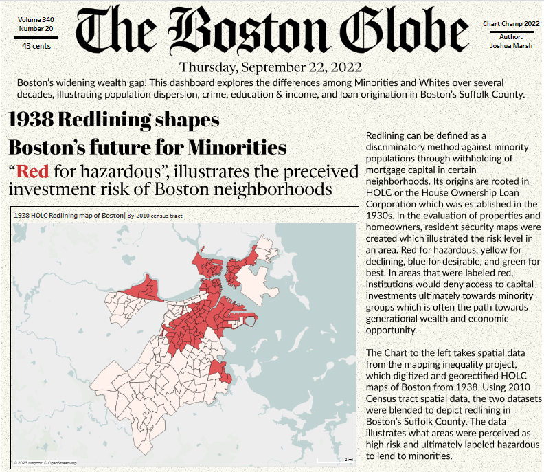
The first view of the dashboard was intended to paint the picture for the rest of the visualizations. I started with outlining the redlined zones of Boston to convey to the audience the history of the practice while establishing the breadth of the analysis. From here on out the audience should fixate to only Boston’s Suffolk County and be aware that the content will convey disparities associated with race.
Pulling in the required datasets
In order to visualize the map with the associated color theme, I needed to blend together tabular and spatially encoded datasets.
Thanks to the efforts of The Mapping Inequality project, which is a collaboration of faculty from some prestigious schools, the zones identified as being redlined were readily available. The project made publicly available the neighborhoods in 239 cities which were classified by their investment risk from the federal government’s Home Owner’s Loan Corporation (HOLC)
Ever wonder what a census tract is? Its a geographic region defined for the purpose of taking a census and something I was unaware of prior to this project. The US Census bureau collects these files which help to identify an associated State’s census blocks.
Boston.gov provides a wealth of datasets that pertain to the city. The neighborhoods shapefiles outline the zoning neighborhood boundaries. These files are made public by the city’s Analytics team.
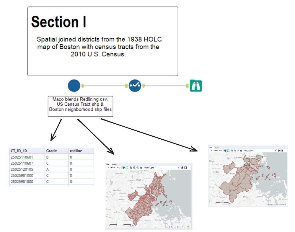
Blending the data into a single dataframe
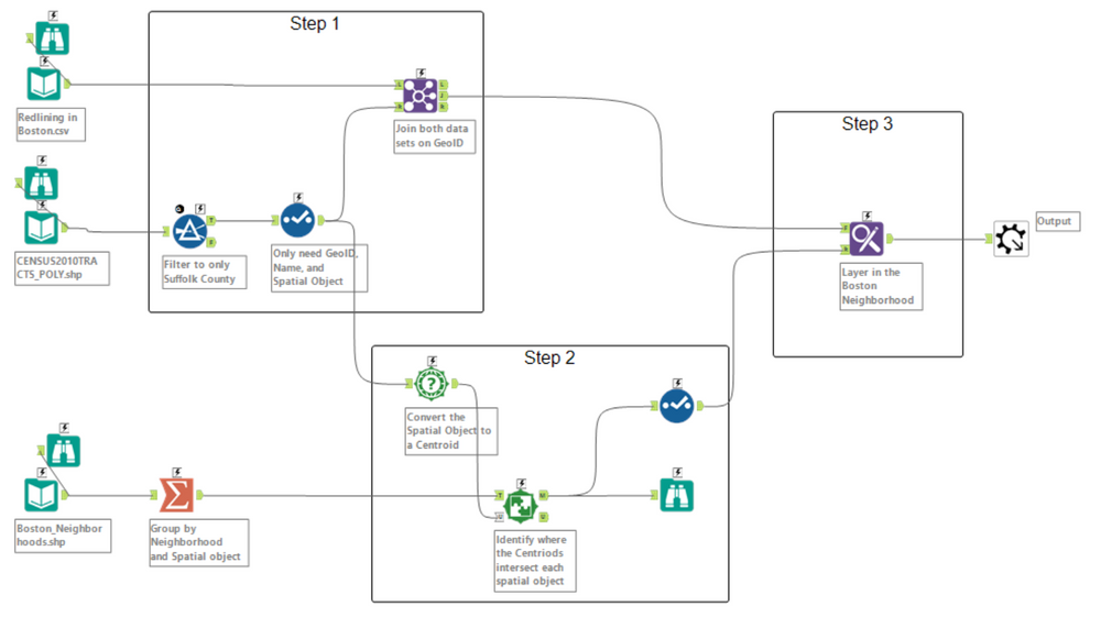
The above snippet is the innerworkings of the macro displayed earlier. The workflow can be broken up into 3 steps, Blending the Redlining and Census tract datasets, Finding where each Boston neighborhood contains the applicable census tract(s), and layering in the Boston neighborhood field.
Blending the Redlining and Census tract datasets
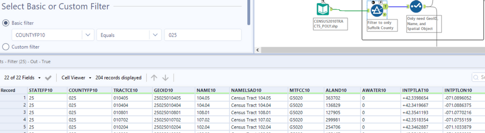
The task here is to create a dataset that is limited to Boston’s Suffolk County and contains the encoded redlining data. Lets first filter our Census Tract data to only include Suffolk County, this is based on the COUNTYFP10 field where the value should reflect 025.
Then we are going to join the datasets, which will be on the geographical unique identifier. This at first took a little bit of trail and error to find the appropriate column in the Census data but the redlining data clearly defines this field.
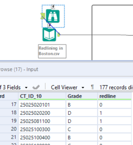
Notice that the Redlining dataset has three columns. The first is our unique identifier to join on with the second and third being a categorical and boolean field. The grade identifies the investment risk that HOLC assigned to the tract with the redline field identifying if the area was redlined. This is important to note because this is how the visualization above was marked with color.
Finding where each Boston neighborhood contains the applicable census tract
The next step is to identify which census tract belongs to which Boston Neighborhood. At this point we can visualize our data with the appropriate color combination but now I want to be able to identify which neighborhoods were actually redlined. To do this lets first convert our spatial objects (Census Tracts) to centroids using the spatial info tool, then find which neighborhood contains each of the centroids.
If you’ve ever used the spatial match tool in Alteryx, it can be a little confusing at first but here is how I like to remember the operations at hand. You can think of your Target as a galaxy (Milky way, Andromeda, etc) and the Universe as a bunch of stars.

What we want to do is find the stars in our galaxy or said differently, where our Target Contains Universe. From here you should get an idea of which inputs you’d use for the T (Target) and U (Universe). The target should contain our spatial object and the Universe should be our centroids.
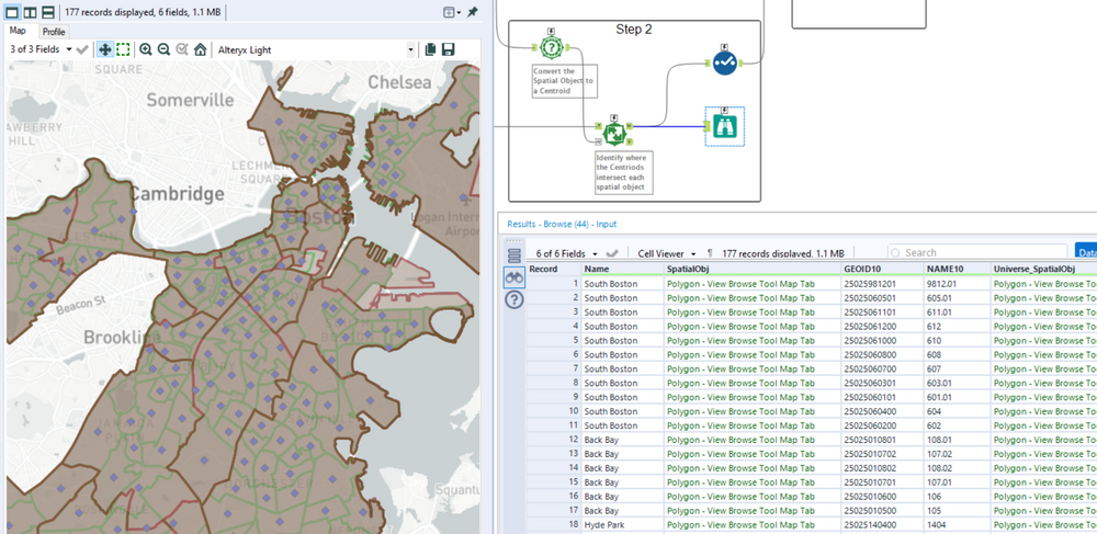
The result is a map that identifies our Boston neighborhood as well as the associated census tracts. This furthers our analysis by being able to answer questions like, Which Boston Neighborhoods were redlined? or What was the total sq miles identified as having the highest investment risk?
Layering in the Boston neighborhood field
The last step is also the simplest one. The final operation is to take the neighborhoods that we just identified and join them to our map of census tracts and redline dimensions. This is a simple vlookup (in excel terms) but done with the find replace tool. Since our GEOID field is in both datasets and a string value we can use this to look up against.
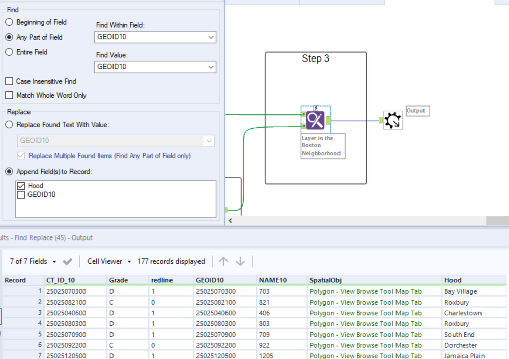
Now this is a good looking dataframe! We have everything we need to build a nice visualization in Tableau and the foundation to answer other questions with the data.
A last bit of advice. Even though this is the first visualization in the dashboard, it was the last piece of data I analyzed. I stumbled upon this angle for my analysis by continuing to ask the question, what is the point I’m trying to make? I say this to say that the analytic journey is not linear, its always filled with twists and turns. But if you stay true to your destination and keep asking questions (and re-asking questions) you’ll eventually get to the truth. And also, data can be found anywhere so don’t stop looking!