Welcome to another installment of “It Depends”. In this post we’re going to look at three different methods for using Tableau for Market Basket Analysis. If you aren’t familiar with this type of analysis, it’s basically a data mining technique used by retailers to understand the relationships between different products based on past transactions.
If you do a quick Google Search for “Market Basket Analysis in Tableau”, chances are you’re going to come across 50 different images and blog posts that look exactly like this.
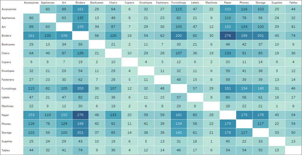
The chart above shows how many times products from two different categories have been purchased together. While that information may be helpful, it’s not a true Market Basket Analysis. This approach only looks at the frequency of those items being purchased together and doesn’t take other factors into consideration, like how often they are purchased separately. It doesn’t provide any insight into the strength of the relationships, or how likely a customer will purchase Product B when they purchase Product A. Just looking at the chart above, it looks like Paper and Binders must have a pretty strong relationship. But let’s look at the data another way.
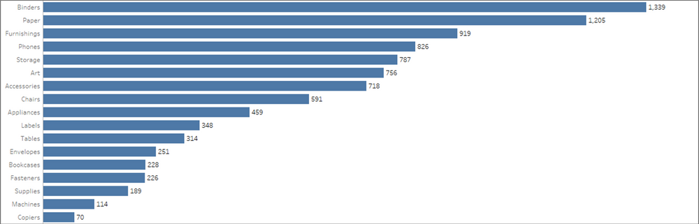
Paper and Binders are the two most frequently ordered product categories, so chances are, even by random chance, that there will be a high number of purchases containing both of those categories. But that doesn’t mean there is a significant relationship between the two, or that the purchase of one in any way affects the purchase of the other. That’s where the real Market Basket Analysis comes in.
As I mentioned, we’re going to cover three different methods in this post. Which is the right one for you? Well, it depends. The right method depends on your data source, and what you hope to get out of the analysis. Feel free to download the sample workbook here and follow along. Here’s a quick overview of each method and when to use it.
Methods
Method 1: Basic
This method is the one that is shown in the intro to this post. Use this method if you are just looking for quick counts of co-occurrences and aren’t interested in further analysis on those relationships. This method also only works if you are able to self-join (or self-relate) your data source. So if you are working with a published data source, or if your data set is too large to self-join (which is often the case with transactional data), then move on to Method 3.
Method 2: Advanced
This is the ideal scenario. This method provides all of the insight lacking from the Basic Method above, but it also relies on self-joining your data.
Method 3: Limited
This method is a little less flexible/robust than Method 2, but often times, it’s the only option. You can use this method without having to make any changes to your data source, and it still provides all of the same insight as Method 2. The real downside is that you can only view one product at a time.
Let’s start by setting up your data source. If you are using Method 3, you can skip over this section, as you won’t be making any changes to the data source with that approach.
Setting Up Your Data Source
For these examples we are going to use the Superstore data that comes packaged with Tableau. So start by connecting to that data source.
Once you’re connected, click on the Data Source tab at the bottom left of the screen.
Next, remove the People and Returns tables.
Then drag out the Orders table again and click on the line to edit the relationships.
Add the following conditions: Order ID = Order ID and Sub-Category <> Sub-Category
Your data source should look like this:
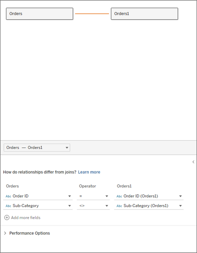
Just a quick pause to explain why we are setting up the data this way. By joining the data to itself on Order ID, we are creating additional records. The result is that for each order, we now have a row for every product combination for each order. The second clause (sub-category), eliminates the records where the sub-categories are the same. Here is a quick example.
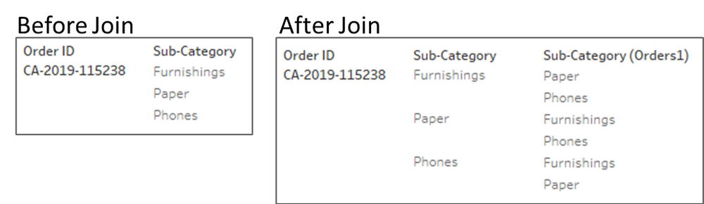
For the order above, there were three sub-categories purchased together. By self-joining the data, we can now count that same order at the intersection of each of the products (Furnishings-Paper, Furnishings-Phones, Paper-Furnishings, etc.)
Now that our data source is set, let’s get building.
Method 1: Basic
This method is very quick to build and doesn’t require any additional calculations.
- Drag [Sub-Category] to Rows
- Drag [Sub-Category (Orders1)] to Columns
- Change the Mark Type to Square
- Right-click on Order ID and drag it to Label. Select CNTD(Order ID) for the aggregation
- Drag [Sub-Category (Orders1)] to Columns
- Change the Mark Type to Square
- Right-click on Order ID and drag it to Label. Select CNTD(Order ID) for the aggregation
- Right-click on Order ID and drag it to Color. Select CNTD(Order ID) for the aggregation
- Drag [Sub-Category (Orders1)] to the Filter shelf and Exclude Null (these are orders with a single sub-category)
You can do some additional formatting, like adding row/column borders, hiding field labels, and formatting the text, but as far as building the view, that’s all there is to it. When you’re done, it should look something like this:
Method 2: Advanced
This method is a little bit more complicated, but the insight it provides is definitely worth the extra effort. The calculations are relatively simple and I will explain what each of them is measuring and how to interpret it.
To start, I am going to re-name a few fields in my data source. Going forward I am going to refer to the first product as the Antecedent and the product ordered along with that product as the Consequent.
- Rename [Sub-Category] to [Antecedent]
- Rename [Order ID] to [Antecedent_Order ID]
- Rename [Sub-Category (Orders1)] to [Consequent]
- Rename [Order ID (Orders1)] to [Consequent_Order ID]
Now for our calculations.
- Total Orders = The total number of orders in our data source
- Antecedent_Occurrences = The total number of orders containing the Antecedent product
- Consequent_Occurrences = The total number of orders containing the Consequent product
- Combined_Occurrences = The total number of orders that contain both the Antecedent and Consequent products
- P(A) = The probability of an order containing the Antecedent product
- P(C) = The probability of an order containing the Consequent product
- Support = The probability of an order containing both the Antecedent and Consequent products
These last two metrics are the ones that you would want to focus on when analyzing the relationships between products.
- Confidence = This is the probability that if the Antecedent is ordered, that the Consequent will also be ordered. For example, if a customer purchases Product A, there is a xx% likelihood that they will also order Product B.
- Lift = This metric measures the strength of the relationship between the two products. The higher the number, the stronger the relationship. A higher number would imply that the ordering of Product A, increases the likelihood of Product B being ordered in the same transaction. Here is an easy way to interpret the Lift value
-
- Lift = 1: Product A and Product B are randomly ordered together, but there is no relationship between the two
- Lift > 1: Product A and Product B are purchased together more frequently than random. There is a positive relationship.
- Lift < 1: Product A and Product B are purchased together less frequently than random. There is a negative relationship.
- Lift > 1: Product A and Product B are purchased together more frequently than random. There is a positive relationship.
- Lift < 1: Product A and Product B are purchased together less frequently than random. There is a negative relationship.
Once you have these calculations, there are a number of ways you can visualize the data. One simple way is to put all of these metrics into a Table so you can easily sort on Confidence and Lift. Another option is to build the same view we had built in Method 1, but use Lift as the metric instead of order counts. Here is how to build that matrix.
- Drag [Antecedent] to Rows
- Drag [Consequent] to Columns
- Change the Mark Type to Square
- Drag [Lift] to Color (here you can use a diverging color palette and set the Center value to 1)
- Drag [Lift] to Label
After some formatting, your view should look something like this:

If you compare this matrix to the one in Method 1, you may notice that the Lift on Paper & Binders is actually less than 1. So even though those products are present together on more orders than any other combination of products, the presence of one of those products on an order, does not impact the likelihood of the other.
Method 3: Limited
This is the method that I have used most frequently because it doesn’t rely on self-joining your data. Typically, transactional databases have millions of records, which can quickly turn to billions after the self-join. So this method is much better for performance, and it can even be used with published data sources. The fields that we need to calculate are all the same as in Method 2, but the calculations themselves are a bit different.
If you skipped over Method 2, we had renamed a few of the fields. With this approach, we’re just going to rename one field. Change the name of the [Sub-Category] field to [Consequent].
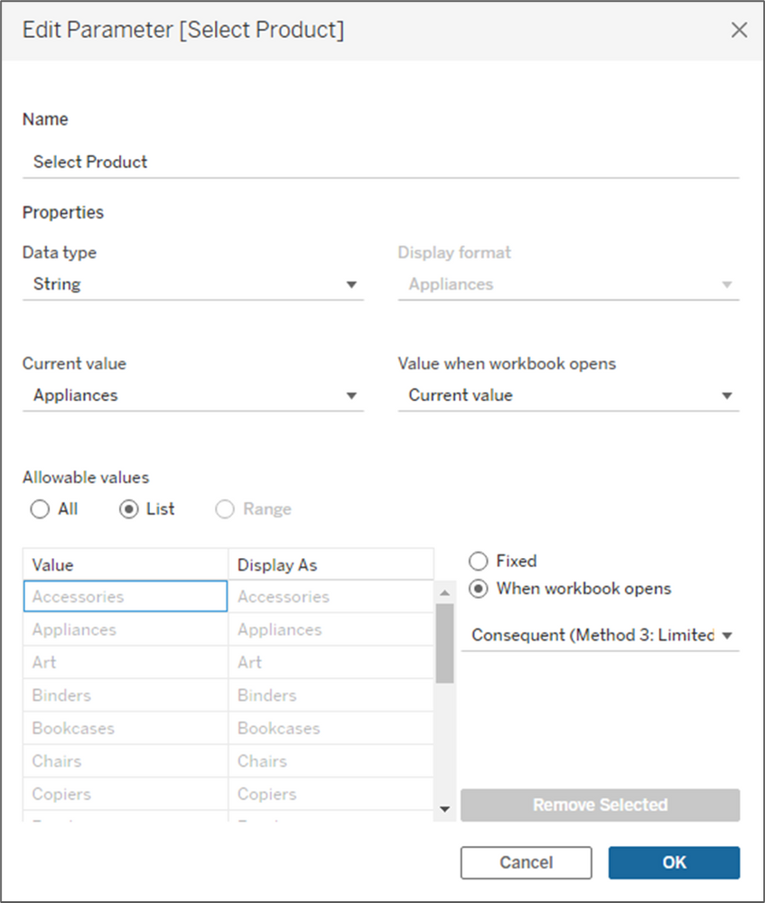
As I mentioned before, with this method, users can only view one product at a time, so the first thing we need to do is build a parameter for selecting products. Create a new parameter that is set up like the image below and name it [Select Product]. In the lower section, make sure to select “When workbook opens” and select the [Consequent] field, so that parameter will update when new values come in.
Before we build the calculations we had used in Method 2, there are a few other supporting calcs that we will need. Build the following calculations.
- Antecedent = This is set equal to the parameter we built above
- Product Filter = This Boolean calculation tests the Consequent (Sub-Category) field to see if it is equal to the parameter selection
- Product Combination = This is a simple concatenation for the combinations of Product A (Antecedent) and Product B (Consequent)
- Order Contains = This LOD calculation returns true for any orders that contain the product selected in the parameter
- Item Type = For orders that contain the selected product, this will flag items as the Antecedent (the product selected) and Consequent (other items on the order). For orders that don’t contain the selected product, it will set all records to Exclude
With those out of the way, we are going to build all of the same calculations as we did in Method 2, but with some slight modifications. If you skipped over Method 2, I will include the descriptions of each of the calculations again.
- Total Orders = The total number of orders in our data source
- Antecedent_Occurrences = The total number of orders containing the Antecedent product
- Consequent_Occurrences = The total number of orders containing the Consequent product
- Combined_Occurrences = The total number of orders that contain both the Antecedent and Consequent products
- P(A) = The probability of an order containing the Antecedent product
- P(C) = The probability of an order containing the Consequent product
Support = The probability of an order containing both the Antecedent and Consequent products
These last two metrics are the ones that you would want to focus on when analyzing the relationships between products.
Confidence = This is the probability that if the Antecedent is ordered, that the Consequent will also be ordered. For example, if a customer purchases Product A, there is a xx% likelihood that they will also order Product B.
Lift = This metric measures the strength of the relationship between the two products. The higher the number, the stronger the relationship. A higher number would imply that the ordering of Product A, increases the likelihood of Product B being ordered in the same transaction. Here is an easy way to interpret the Lift value
- Lift = 1: Product A and Product B are randomly ordered together, but there is no relationship between the two
- Lift > 1: Product A and Product B are purchased together more frequently than random. There is a positive relationship.
- Lift < 1: Product A and Product B are purchased together less frequently than random. There is a negative relationship.
The visualization options are a little more limited with this approach. I usually go with a simple bar chart, or just a probability table with all of the metrics calculated above. Something simple like this usually does the trick.
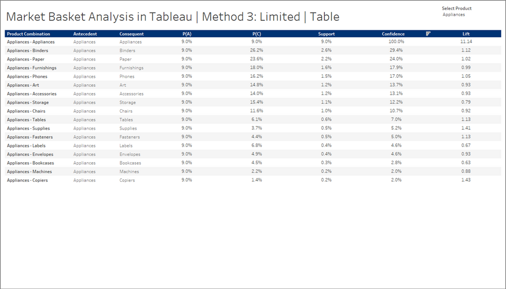
Whatever visual you choose, make sure to display the parameter so users can select a product, make sure to include the Product Combination somewhere in the view, and make sure to add the following filter.
Item Type = Consequent
If you don’t filter out the “Exclude” records, the Confidence and Lift values will be significantly inflated.
That’s it, those are the three methods that I have used for Market Basket Analysis in Tableau. In my opinion, Method 2 is by far the best, but often times unrealistic. But with a little creativity, you can replicate it without blowing up your data source and you can build it using a published data source. Thank you for following along with another installment of “It Depends”.