The following blog by Brian Moore was originally published on Do Mo(o)re With Data December 21, 2021 and is cross-posted here with permission. Brian is a Tableau Ambassador and a Senior Data Analytics and Viz Consultant for Cleartelligence.
In recent years there have been multiple scientific studies designed to confirm what many of us in the Data Visualization Community have already suspected; when it comes to art, people are drawn to curves. Think about some of your favorite pieces of Data Art. I am willing to bet that the majority of them contain some type of curved element. Not only are curves more aesthetically pleasing than straight lines and sharp corners, but they have that ‘WOW’ factor, because as we all know, curved lines do not exist in Tableau. They take effort, and when it comes to drawing curves, most people don’t know where to start. But you don’t need to be an expert in Tableau to create beautiful radial charts, or to add some impressive curves to your dashboards. You just need to know the math, you need to know how to structure your data, and you need to know how to bring those elements together in Tableau. That’s the goal of this series. To hopefully demystify some of this work and make it more approachable, and to provide some examples. This series will focus on three types of curved elements; Circles, Bezier Curves, and Sigmoid Curves.
Drawing Circles in Tableau
Tableau does have a ‘Circle’ mark type that can be used, but being able to draw your own circles opens up a world of possibilities. The calculations that are used for drawing a circle, are the same calculations that can be used to create any type of radial chart you can imagine. For this post, I am going to keep the math as simple as possible, but if you’re interested in diving deeper I would recommend checking out this post by Ken Flerlage.
Once you have your data structured there are really only 2 inputs needed to create your radial; the distance of each point from the center of the circle (radius), and the position of each point around the circle. We’ll discuss these inputs a lot more in this post, but let’s start with our data structure. To follow along with this post, you can download the sample data here and download the workbook here.
Building Your Data Source
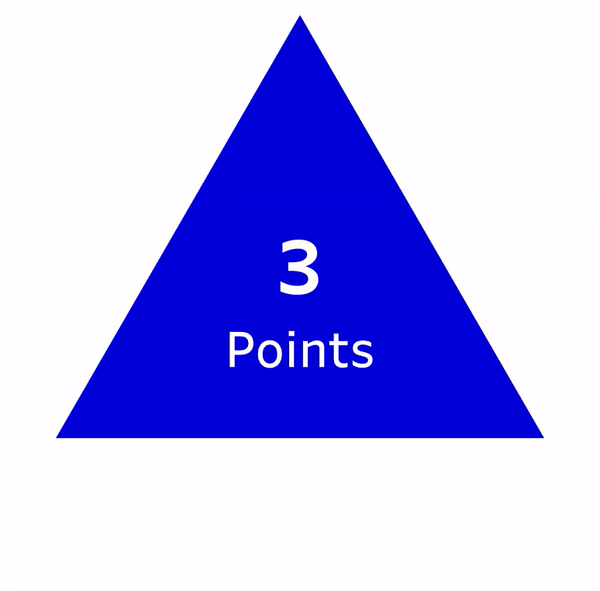
To create any type of curved element in Tableau, you’ll need to start by densifying your data. To create your densification table, create a table in Excel with 1 column, in the first cell name that column ‘Points’, and then add rows with numbers 1 through however many points you wish to create. There are a few things to consider when choosing that number. Choosing a number that is too high may affect performance as that many rows will be added to your data source for each record in your ‘Core’ data set (a data source with 1000 rows will turn into 100,000 if you choose 100 points). Choosing a number that is too low will result in visible straight lines and corners instead of a smooth curve. Here is an example to help visualize how the number of points can affect the shape
I will usually choose somewhere between 50 and 100 points, closer to 50 when the circles will be small, and closer to 100 when the circles will be large. For this post, we’ll go with 50 points, so your densification table should look something like this.

And here is some sample data we’ll use as our ‘Core’ data source. We have 10 records that we’ll use to create 10 distinct circles, and we’ll use the ‘Value’ column to size the circles appropriately. I use this technique frequently, instead of the ‘Circle’ mark type in Tableau, to ensure that the size (area) of each circle accurately represents the underlying value. When designing my ‘Core’ data source, I like to use a sequential ‘ID’ field, starting from 1. This can help make some of the calculations easier, but if it’s not an option, you can typically replace that ‘ID’ field with the INDEX function in Tableau.

Now that we have our ‘Core’ data set, and our densification table, let’s bring these together in Tableau. To densify our data we’ll need to join these two tables in the physical layer in Tableau.
First, connect to your ‘Core’ data. In this example, that table is called ‘CircleData’
Drag your ‘CircleData’ table onto the Data Source pane
Double-click on the ‘CircleData’ Logical Table to view the Physical Tables
Drag your ‘Densification’ data onto the Data Source pane. In this example, this table is called ‘CircleDensification’
Join the tables with a Join Calculations
On the left side of the join, click on the drop-down and select ‘Create Join Calculation’
In the calculation box enter the number 1
Repeat the steps above on the right side of the join
When complete, your data source should look like this:

Building Your Calculations
Now that we have our data source, the next step will be to build our calculations. As I mentioned earlier, there are 2 inputs that we’ll need to draw our circles; the distance of each point from the center of the circle, and the position of each point around the circle. Let’s start with the distance calculation.
In this example, we want the area of the circle to represent the value in our data. The distance from the center of a circle to the outside of the circle is known as the radius, and we can calculate that with the formula below. This will serve as our first input.
r = √A/π or in plain English Radius = Square Root of Area/Pi
In our data we have the Area (Value) so we can calculate the radius for each of circles using the calculation below in Tableau. Create a new calculated field called ‘Radius‘ and copy the formula below
Radius
SQRT([Value]/PI())
For the next input, we’ll need to calculate the position of each point around the circle. For each circle, we have 50 points (the number of rows in our densification table) and we’ll want to evenly distribute those points around the circle. The resulting number will be a percentage and will represent how far around the circle that point appears. For example, imagine you were looking at a clock. 3 o’clock would be 25%, 6 o’clock would be 50%, 9 o’clock would be 75% and 12 o’clock would be 100%

We can calculate that percentage for each point by taking the value of the Points field divided by the Max Value of that field (which would represent the number of points or number of rows in our densification table). So the Position calculation would be as follows in Tableau:
Position
[Points]/{MAX([Points])}
Note* if you plan on using the ‘Line’ mark type to draw your circles instead of the ‘Polygon’ mark type, you should modify this calculation by subtracting 1 from the divisor, [Points]/{MAX([Points])-1}. This is because polygons will automatically connect your first and last point. For lines, we need to force that connection.
Now your data should look something like this. For each record in your ‘Core’ data set, you have 50 points, with position values equally spread between 0-100%

Now we have our 2 inputs and all that is left to do is to translate these inputs into X and Y coordinates, which can be done with two simple calculations
X
[Radius]* SIN(2*PI() * [Position])
Y
[Radius]* COS(2*PI() * [Position])
Build your Circles
Follow the steps below to build your circles
Right click on the [X] field, drag it to columns, and when prompted, choose the top option ‘X’ without aggregation
Right click on the [Y] field, drag it to rows, and when prompted, choose the top option ‘Y’ without aggregation
Change the Mark Type to ‘Polygon’
Right click on the [Points] field, drag it to Path, and when prompted, choose the top option ‘Points’ without aggregation
This tells Tableau what order to ‘connect the dots’ in.
Drag [Circle Name] to color
When you finish, your worksheet should look something like this:

Right away, you’ll probably notice a few things about this. First, these look like ovals, not circles. And second, there are only 2 circles when there should be 10. The reason they look like ovals is because the worksheet is wider than it is tall. It’s important when you place a radial chart on a dashboard that you set the width and height equal and that you Fix both the X and Y axis to the same range. The reason there are only two circles visible is because all 10 circles have the same starting position (0,0), so they are currently stacked on top of each other.
Arrange Your Circles
There are a number of techniques you can use to arrange these circles. You could place the [Circle ID] field on Rows to create a column of circles, or on Columns to create a row of Circles. Or, with a little more math, you could do a combination of these and create a trellis chart, or ‘small multiple’. But personally, I like to use ‘offset values’ which place everything on the same pane and give you total control of the placement of each object.
First, let’s place all of these circles in a single row. To do this, we’ll create a numeric parameter and set the value to 10. This is going to be used to set the spacing between each circle. To increase the spacing, set the parameter higher. To decrease the spacing, set the parameter lower.

Now we’ll create our ‘offset value’.
Circle Offset
[Circle ID]*[Circle Offset Parameter]
And next, we’ll add that value to our [X] calculation:
X
[Radius]* SIN(2*PI() * [Position]) + [Circle Offset]
And here is the result:

This works because it moves every point in each circle an equal amount. For Circle 1, the [Circle Offset] value will be 10 (Circle ID is 1 x Circle Offset Parameter is 10 = 10). Adding that to the [X] value that was previously calculated will move every point in that circle 10 to the right. For Circle 2, the [Circle Offset] value will be 20 (Circle ID is 2 x Circle Offset Parameter is 10 = 20), which will move every point in that circle 20 to the right.
If we add the [Circle Offset] value to the [Y] calculation instead of [X], the result will be a single column of circles. And if we add the [Circle Offset] field to both the [X] and the [Y] values, the result will be a diagonal line.

So those are some easy ways to plot your circles in a line…but this is a post about circles. So…let’s plot them in a circle. And to do this we’re going to use the same techniques we used to draw the circles.
First, let’s create one more parameter that will serve as the radius of our new circle. We’ll call it ‘Base Circle Radius’ and set the value to 30:

That parameter will be one of our two inputs for plotting points around a circle. The second input is going to be the position. Previously, we had 50 points that we wanted to plot evenly around a circle. Now, we have 10 points (10 circles). Previously, we had values 1 thru 50 (the Points field). Now, we have values 1 thru 10 (the Circle ID field). So using the same technique we used earlier, we’ll calculate the position of each circle around our ‘Base’ circle.
Base Circle Position
[Circle ID]/{MAX([Circle ID])}
Now, we have our two inputs and we can use the same calculations to translate those into X and Y values
Base Circle X
[Base Circle Radius]* SIN(2*PI() * [Base Circle Position])
Base Circle Y
[Base Circle Radius]* COS(2*PI() * [Base Circle Position])
Now all you need to do is add these values to your [X] and [Y] calculations respectively, similar to what we did in the previous section
X
[Radius]* SIN(2*PI() * [Position]) + [Base Circle X]
Y
[Radius]* COS(2*PI() * [Position]) + [Base Circle Y]
And here is the result, a circle of circles:

Now this is just one simple example of what’s possible once you know how to plot points around a circle. I use these same few calculations, with some modifications, in a ton of my Tableau Public visualizations. Here are a few examples that use this technique:


Thank you so much for reading the first of many posts on Do Mo(o)re With Data and keep an eye out for the second part of this series.