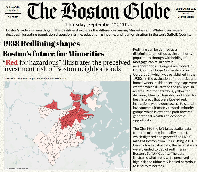
The next section of the dashboard below extends from the first article on visualizing redlining in Boston’s Suffolk County to understanding affects of those policies on future populations. Section 2 addresses Minority population growth and the movement of racial groups over generations. I’ll illustrate the process of extracting the data necessary for the analysis behind the visualization below.
Section 2: Visualizing population growth of minorities in Boston’s Suffolk County
Let me tell you, this was probably the most difficult part of the dashboard from a conceptual view. I wanted to show the movement of minorities over several years but I originally spent too much time thinking about the chart type. Sankey chart, Sunburst maybe, it had to be captivating or attention grabbing. Yet, I was too enamored with the front end and had not yet grasped the underlying analysis. Until I stumbled upon the concept of “Majority Minority”, a term describing when one or more racial or ethnic groups make up a population. With this in mind the analytic journey brought me to focus not just on overall population growth but the composition of it. Further, how could redlining in the first section play a role here? Lets discuss!
Pulling the required datasets
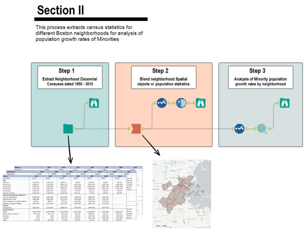
This process begins with extracting yearly Census demographic data, then blends in neighborhood spatial objects, to ultimately analyze population growth rates.
Boston Neighborhood Demographics 1950-2010
The historical tables created by the BPDA Research Division from U.S. Census Decennial data describe demographic changes in Boston’s neighborhoods from 1950 through 2010 using consistent tract-based geographies.
Boston.gov provides a wealth of datasets that pertain to the city. The neighborhoods shapefiles outline the zoning neighborhood boundaries. These files are made public by the city’s Analytics team.
Step 1 : Extract neighborhood decennial census data
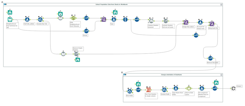
The first task is to extract and standardize the excel files retrieved from Analyze Boston into one single data frame. The workbook is broken up by tab (each neighborhood) with columns representing yearly population figures. Each worksheet is organized with a header and sub header of a category and its components (i.e. Age : 0-9, 10-19, etc).
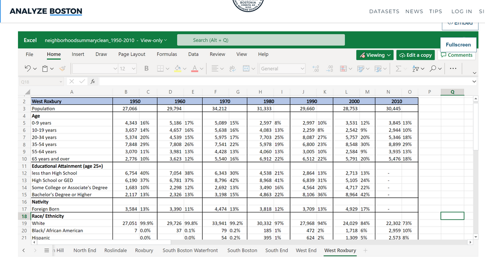
In Alteryx its very easy to extract this data even though its comprised of multiple worksheets. The first part of the workflow reads in the individual sheet names to be inserted in the full path directory via a formula tool. This is followed by a dynamic input tool to extract the corresponding data via each full path (similar to an input tool configured to each sheet).

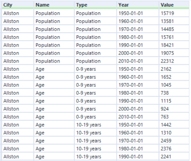
Once all of the data is read in, the remaining steps are attributed to munging and orienting the data to the correct format. The data should reflect a long orientation with values applicable to City (tab names), Name (Header), Type (Sub Header), and Year/Value representing the yearly population data. Before this can be completed we have to get rid of some of the columns we won’t need.

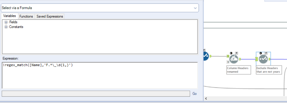
Notice how at this stage of the workflow the data is read in with a column associated with a year and a field_n. Further, if you examine the excel worksheet above you can see that the year header is merged over two cells (Population and % of Total Population). I only require the fields with a year header and the applicable values. This operation can be completed by adding a select tool and unchecking the appropriate fields but I’ll use a dynamic select tool instead. The reason being is that this is scalable! If we were to run this process 10 years from now we wouldn’t have to update the select tool, our workflow will do the work for us. A simple regex express does the trick here to look for columns that match our required format.
The last couple of tools transposes the data, layering in the applicable header/sub header hierarchy before converting any date fields to the proper format. At its conclusion, the data should be formatted accordingly.
Step 2 : Blend neighborhood objects with Population by Race

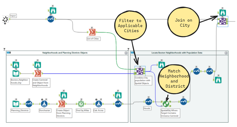
This process is very simple and may look a bit familiar as we did a similar process in the first article. The goal here is to take the data frame above and layer in the neighborhood spatial objects. This will allow us to visualize each neighborhood on a map. Its easier to first filter our Spatial objects to only the records we extracted from the excel workbook, by performing a join on City name. I bring in two shape files here, one for neighborhoods and one for planning districts with the difference being that planning districts group neighborhoods together (i.e. Brighton & Alston -> Brighton/Alston). The original intent was to do the analysis as the Boston Planning and Development Agency would, as this is how they look at Suffolk County. But ultimately I used the data at the lowest level of granularity.
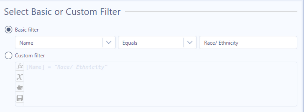
After the spatial objects are joined in, we can filter the dataset by our Name field to only include data represented by Race and Ethnicity.
Step 3 : Calculate CAGR of Minority population percentage

Now its time for some analysis as our data is prepped and ready. There are three main steps in this workflow outlined below:
-
- Create Race/ Ethnicity Group – Minority or Non-Minority White
- Calculate Percent of population and Total number of years
- Calculate the Constant Annual Growth Rate(CAGR) by Race & neighborhood
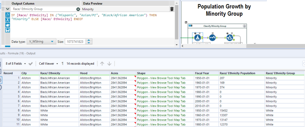
I’ll first rename the column Type to Race/Ethnicity since this dataset is only comprised of those values. The racial groups comprised of minorities will be Hispanic, Asian/Pacific Islander, & African American. Otherwise we will keep the original Race/Ethnicity.
We now need to group our data into three sections, a Sum of the total population, a breakdown of population by Race, and the number of years our data spans. This is handled by summarizing the data in each of the applicable summarize tools. We’ll calculate the Population percent as [Race/ Ethnicity Population] / [Total Population] and our number of years as DateTimeDiff([ending amount], [beginning amount],’years’). Note that we have to limit this only to our Minority groups.

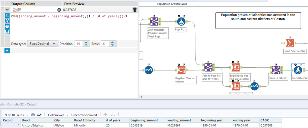
This final part takes a little bit of finagling. I have to compute the CAGR which is comprised of a Beginning Amount and Ending Amount and the Number of years. In the step prior, the last summarize tool groups by the Min and Max year in each Race Group partition. If you notice the transpose tool above before the last join, you may pick up how I’m orienting the data. This is so I go from having a column for each Min/Max year to these records as rows (with the associated number of years as another column). I can then join my population percent values accordingly by year, race, & city. After re-orienting the data’s position, the formula then becomes an easy plug in of the applicable values.
Conclusion
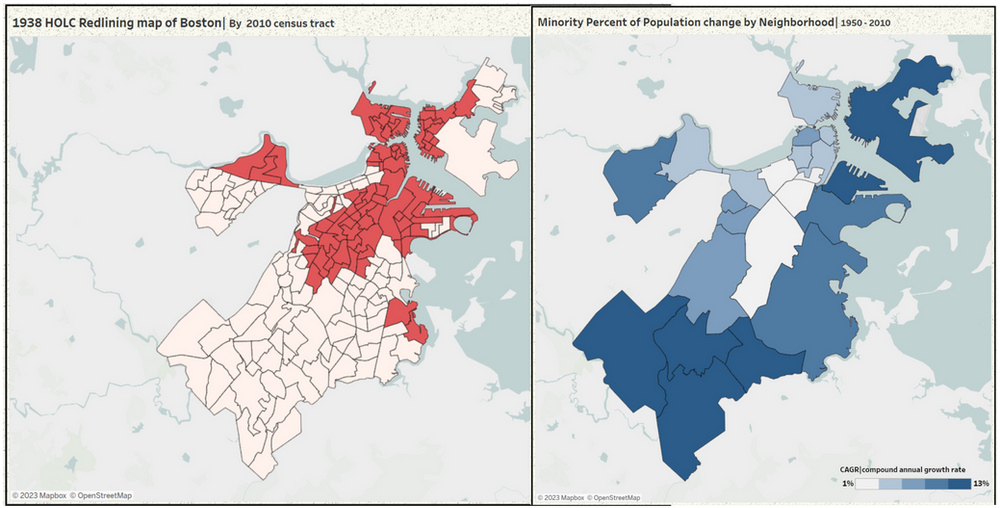
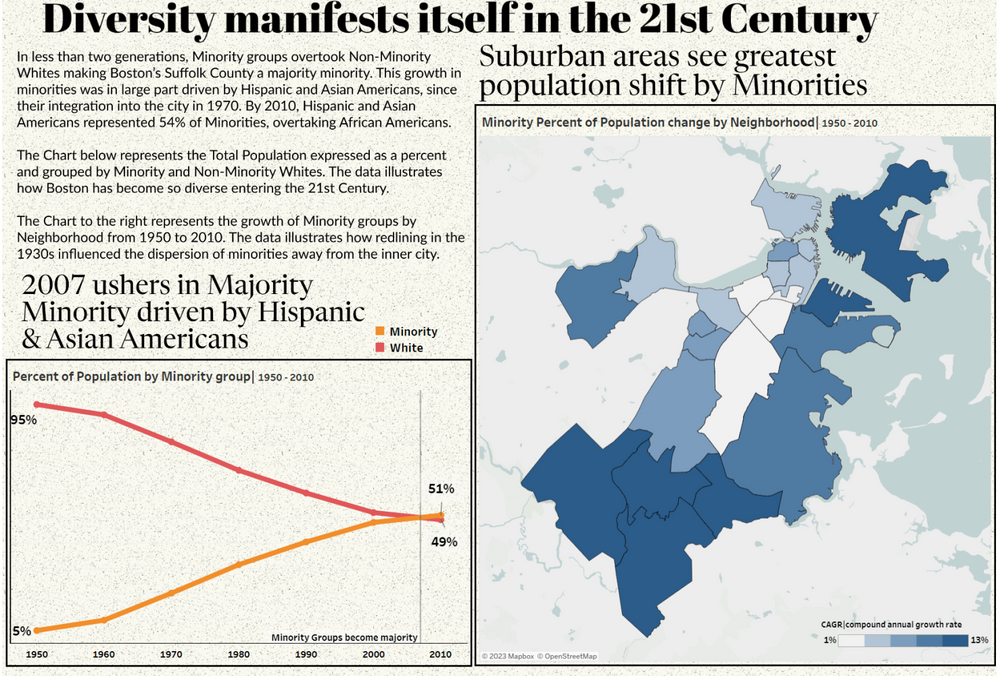
And that wraps up the three steps comprising our analysis. The final product is the snap shot of the dashboard shared earlier. The line graph on the right focuses on the original topic of “Majority Minority” where I visualize the Racial groups population percent by year. The key here is that Boston’s Suffolk County became majority minority in 2007, which is an important tidbit as that spanned over two generations (from the inception of the data in 1950). The map to the right visualizes the CAGR of Minority Population percent by neighborhood. I assign color here to the CAGR value where the darker the color the higher the growth rate. Said differently (keeping the 2007 majority minority date in mind), this chart visualizes the neighborhoods where Minority populations grew the fastest.
Now here is the most important part, lets take the redlining map from article 1 and compare it to our Minority population percent growth map. Anything stand out to you here? Again, remember the legends – Red indicates regions where Minorities were withheld from obtaining mortgage capital (i.e. hard to own property) and Blue indicates where Minority populations grew the fastest. See it now…
