What do optical illusions have to do with data visualization?
Aside from being kind of fun, optical illusions tell us a lot about how human visual perception changes how we interpret what we see. These illusions expose to us areas to be aware of when presenting information visually, and how perception can change the interpretation of the information when presented to different individuals or in different circumstances. As data visualization practitioners, we are communicating with images. Our work is subject to these same visual systems, but the result is less fun when your charts are misinterpreted, but they can also be used to benefit the user.
Let’s take a few examples:
- Size
- Color
- Attention
- Pattern Completion
Size
WHICH OF THE TWO ORANGE CIRCLES IS LARGER?
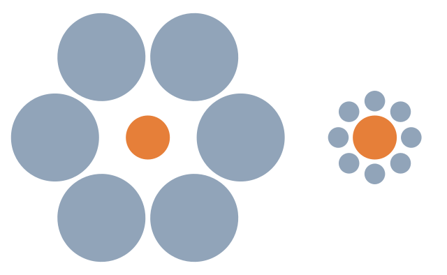
Our brains interpret the right circle as larger due to its size relative to the smaller circles around it. In reality, the circles are the same size.
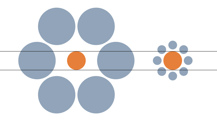
When we use size to encode data, being aware of how a mark appears relative to other objects in a chart can help avoid misinterpretation of the data. For example, from the Superstore dataset, I have placed Discount on size.
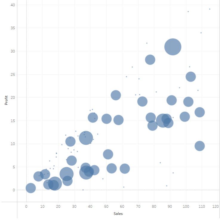
It’s difficult to see what marks have the same discount, until they are highlighted using color.
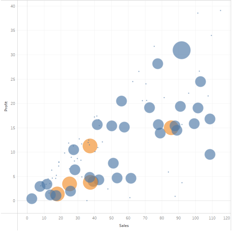
We can run into this effect any time we are encoding data on size, so double encoding the data may be needed to make the visual more clear.
WHICH LINE IS LONGER?
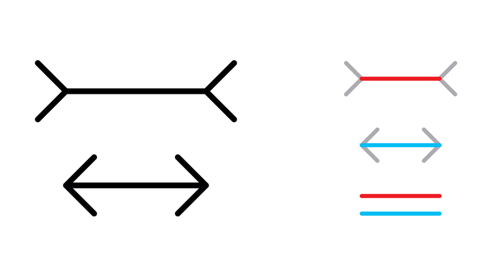
This illusion illustrates the effect additional shapes can have on the perception of length.
If the additional shape equally impacts all marks, such as with a dumbbell or lollipop chart, this is less of a concern. The precision of the chart can be affected, but the interpretation won’t be heavily impacted.
If we are using additional marks to encode more information, we should be aware of the fact that it can alter the interpretation, or change the perceived (or actual) size of the primary mark.
Now, this doesn’t mean you can’t use shapes with other marks. If the actual value is less important than the information conveyed with additional marks, perhaps this is ok. It depends on the goals of the visual.
Color and Shade
WHICH COLOR IS DARKER?


In this illusion, we can see that the circles appear darker on a lighter background, and lighter on a darker background, even though they are the same color.
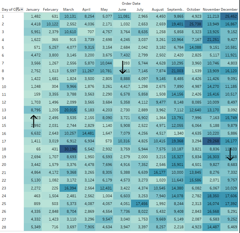
When using a continuous color palette, we want to beware that a color can be interpreted differently depending on how the shades are distributed.
So a similar value could be interpreted as being good or bad simply based on the other marks in close proximity, even though the number itself is the same. This can be used to call attention to outliers, like an unusual seasonal ordering pattern, if that is the intention of the chart.
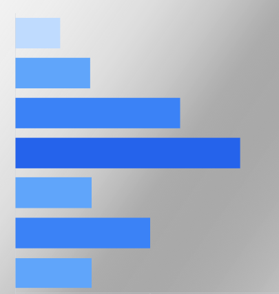
When using gradient backgrounds, it can also alter the perception of the colors used in the visual, making those on the lighter section of the background appear darker, and those on the darker section of the background appear lighter.
Many of us have seen the famous dress illusion or the pink sneaker illusion. Color is tricky! When using color to show dimensions, depending on the other colors used, those colors may be misinterpreted.
Using fewer colors and ensuring they are different enough in hue and value will help ensure this doesn’t hinder or alter the interpretation.
Bonus! It’s also better for users with color vision deficiency and impaired vision.
Attention
LOOK AT RIGHT SIDE OF THE FORK. HOW MANY TINES ARE THERE?
NOW LOOK AT THE LEFT SIDE OF THE FORK. HOW MANY TINES ARE THERE?

We can use this to our advantage to guide a story, if that is the goal. But, this also means that different users may see different things in a dashboard.
IS THIS A DUCK OR A RABBIT?
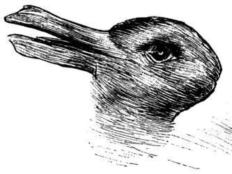
How, and how carefully, we use other visual attributes like color, labels, layout, and helper text can direct the attention and ensure the takeaway is consistent.
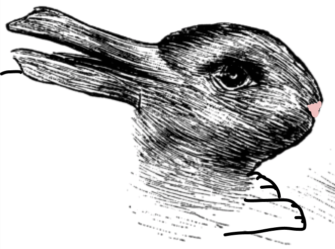
Giving the context needed to orient the viewer will take away the ambiguity. Even just a couple of crude lines to show feet, and a pink nose, and now it’s definitely a bunny.
Pattern Finding
Humans have a brain that is made to find patterns. It’s what we do. And, it’s why data visualization can be so effective.
DO YOU SEE THE WHITE TRIANGLE?

A shape or pattern can be suggested simply by the pattern of those objects (object completion). The brain is going to be looking for patterns, and things can be created out of the white space. This can help identify patterns or trends.
However, this can also trick the user into seeing a pattern that is incorrect based on the context, as this illusion illustrates.
WHICH LINES CONNECT?
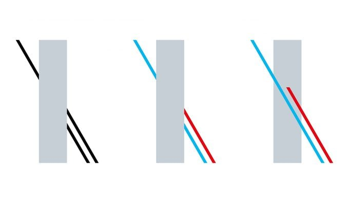
Using visual attributes to help ensure the eye follows the correct pattern can ensure the visual isn’t misinterpreted.
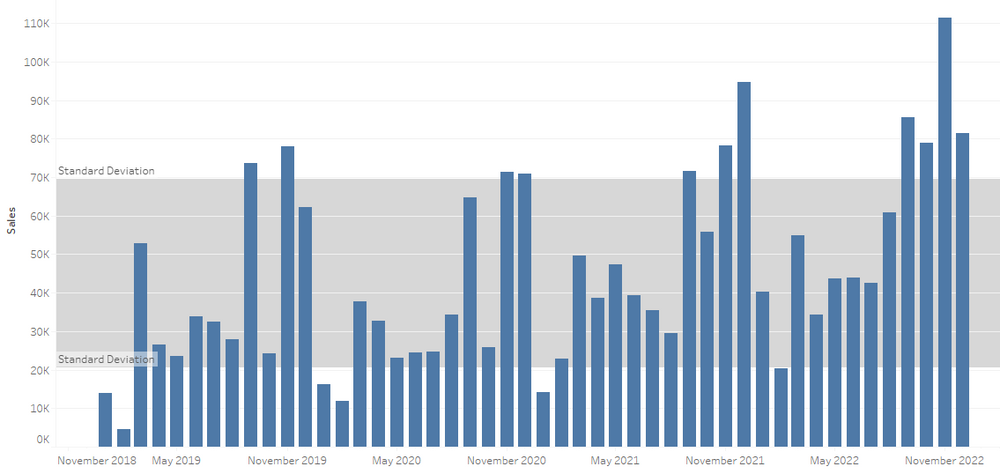
If we know that the human eye is going to be identifying a trend, we can call attention to specific areas to counter this effect. We can also visually identify when a pattern is or isn’t significant. Things like control lines or specifically calling out whether a trend is statistically significant can keep the brain’s pattern finding instinct from causing misunderstanding of what the data actually show or to force a focus on the purpose of the visualization.
For example, all my eye wants to see here is that the totals seem to be trending upward. There are spikes and lulls, but that’s not what my brain is focusing on.
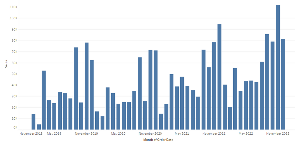
This may be fine if the visual is purely informational, and open to that type of interpretation and analysis. It is often helpful if we can anticipate this and identify if a trend is or is not significant. We can identify things like the impact of seasonality in data. Or we can use things like control charts or highlight colors and indicators to drive attention to the outliers rather than the trend.
This post could probably go on forever, but I’ll stop here. Enjoy, go down the rabbit hole and look up some other optical illusions.
And Remember:
