The following blog by Brian Moore was originally published on Do Mo(o)re With Data September 27, 2022 and is cross-posted here with permission. Brian is a Tableau Visionary, Tableau Public Ambassador, and a Senior Data Analytics and Viz Consultant for Cleartelligence.
Welcome to another installment of “It Depends”. In this post we’re going to look at two different ways to use BAN’s to swap KPI’s in your dashboard. If you’re not familiar with the term “BANs”, we’re talking about the large summarized numbers, or Big Ass Numbers, that are common in business dashboards.
When I build a KPI dashboard, I like to give my users the ability to dig into each and every one of their key metrics, and the techniques we cover in this post are a great way to provide that kind of flexibility. Here is a really simple example of what we’re talking about.
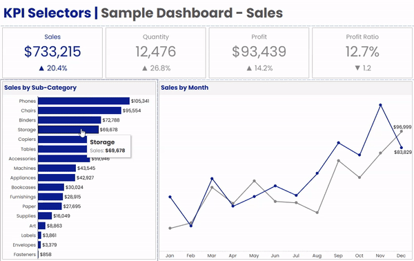
In the dashboard above, we have 4 BAN’s across the top; Sales, Quantity, Profit, and Profit Ratio. Below that, we have a bar chart by Sub-Category, and a Line Chart showing the current vs previous year. When a user clicks on any of the BANs in the upper section, the bar chart and the line chart will both update to display that metric. A couple of other things that change along with the metric are the dashboard title, the chart titles, and the formatting on all of the labels.
We’re going to cover two different methods for building this type of flexible KPI dashboard. A lot of what we cover is going to be the same, regardless of which method you choose, but there are some pretty big differences in how both the BANs and the Dashboard Actions are constructed in each method.
For this exercise we’re going to use Superstore Data, so you can connect to that source directly in Tableau Desktop. If you would like to follow along in the Sample Workbook, you can download that here.
The Two Methods
Measure Names/Values – In the first method we’re going to use Measure Names and Measure Values to build our BANs. When a user clicks on one of the Measure Values, we will have a dashboard action that passes the Measure Name to a parameter.
Individual BANs – In the second method, we’re going to use separate worksheets for each of one of our BANs. When a user clicks on one of the BANs, we’ll pass a static value that identifies that metric (similar to the Measure Name) to a parameter. With this method, we’ll need a separate dashboard action for each of our BANs.
Method Comparison
So at this point you may be wondering, why would you waste time building out separate worksheets and separate dashboard actions when it can all be done with a single sheet and a single action. Fair question. As you’re probably aware, Measure Names and Measure Values cannot be used in calculated fields, so with the Measure Names/Values method, you are going to be pretty limited in what you can do with your BANs. Let’s take another look at the BANs in the example dashboard from earlier.

Numbers alone aren’t always very helpful. It’s important to have context, something to compare those numbers to. Anytime I put a BAN on a dashboard, I like to add some kind of indicator, like percent to a goal, or growth versus previous periods. Another thing I like to do is to use color to make it very obvious which metric is selected and being displayed in the rest of the dashboard. Neither of these are possible with the first method as they both require calculated fields that reference either the selected measure or the value of that measure.
Unlike some of our other “It Depends” posts, the decision here is pretty easy.

Method 2 does take a little more time to set up, but in my opinion, it’s usually the way to go. Beyond the two decision points above, the second method also provides a lot more flexibility when it comes to formatting. But if you’re looking for something quick and these other considerations aren’t all that important to you or your users, by all means, go with the first one.
Methods in Practice
This section is going to focus only on building the BANs and setting up the dashboard actions. We’ll walk through how to do that with both of the methods first, and then we’ll move onto setting up the rest of the dashboard, since those steps will be the same for both methods.
Before we get started, let’s build out just a couple of quick calculations that we’ll be using in one or both methods.
First, let’s calculate the most recent date in our data source. Often, in real world scenarios, you’ll be able to use TODAY() instead of the most recent date, but since this Superstore Data only goes through the end of 2021, we’re going to calculate the latest date.
Max Date: {FIXED : MAX([Order Date])}
Now, let’s calculate the Relative Year for each date in our data source. So everything in the most recent year will have a value of 0, everything in the previous year will have a value of -1, and so on.
Relative Year: DATEDIFF(“year”,[Max Date],[Order Date])
And lastly, we’re working with full years of data here, but that’s usually not the case. In my BANs, I want to be able to show a Growth Indicator, but in a real world scenario, that growth should be based on the value of that metric at the same point in time during the previous year. So let’s build a Year to Date Filter.
Year to Date Filter: DATEDIFF(“day”,DATETRUNC(“year”,[Order Date]),[Order Date])<=DATEDIFF(“day”,DATETRUNC(“year”,[Max Date]),[Max Date])
And that calculation is basically just calculating the day of the year for each order (by comparing the order date to the start of that year), and then comparing it to the day of the year for the most recent order. Again, in a real world scenario, you would probably use TODAY() instead of the [Max Date] calculation.
And finally, we just need one parameter that will store our selection when we click on any of the BANs. For this, just create a parameter, call it “Selected Metric”, set the Data Type to “String”, and set the Current Value to “Sales”.
![Edit Parameter [Selected Metric]](https://static.wixstatic.com/media/1ff66d_2e05d4b4fc15470ebe85e2806f5ab245~mv2.png/v1/fill/w_52,h_46,al_c,q_85,usm_0.66_1.00_0.01,blur_2,enc_auto/1ff66d_2e05d4b4fc15470ebe85e2806f5ab245~mv2.png)
Ok, that’s enough for now, let’s start building.
Measure Names/Values
Follow the steps below to build your BANs using the Measure Names/Values method. I’m going to provide the steps on how the ones in the sample dashboard were built, but feel free to format however you would like.
Building
Right click on [Relative Year] and select “Convert to Dimension”
Drag [Relative Year] to filter shelf and filter on 0 (for current year)
Drag Measure Names to Columns
Drag Measure Values to Text
Drag Measure Names to Filter and select Sales, Quantity, Profit, and Profit Ratio
Right click on Measure Names on the Column Shelf and de-select “Show Header”
Drag Measure Names to “Text” on the Marks Card
Formatting
Change Fit to “Entire View”
Click on “Text” on the Marks Card and change the Horizontal Alignment to Center
Click on “Text” on the Marks Card, click on the ellipses next to “Text” and format
Position Measure Names above Measure Values and set font size to 12
Change font size of Measure Values to 28
Set desired color
On the Measure Values Shelf, below the Marks Card, right click on each Measure and format appropriately (Currency, Percentage, etc.)
Go to Format > Borders and add Column Dividers (increase Level to get dividers between BANs)
Click on Tooltip on the Marks Card and de-select all checkboxes to “turn off”
When you’re done building and formatting your BANs, your worksheet should look something like this:

Now we just need to add this to our dashboard, and then add a a Parameter Action that will pass the Measure Name from our BANs worksheet to our [Selected Metric] parameter.
Go to Dashboard > Actions and click “Add Action”
Select “Change Parameter” when prompted
Give your Parameter Action a descriptive Name
Under Source Sheets, select the BANs worksheet that you created in the previous steps
Under Target Parameter, select the “Selected Metric” parameter we created earlier
Under Source Field, select “Measure Names”
Under Aggregation, select “None”
Under Run Action on, choose “Select”
Under Clearing the Selection Will, select “Keep Current Value”
The Parameter Action should look something like this:

One last formatting recommendation that I would make is to use one of the methods described in this post, to remove the blue box highlight when you click on one of the BANs. Use either the Filter Technique, or the Transparent Technique.
So that’s it for this method…for now. We’re going to switch over to setting up the BANs and dashboard actions for Method 2 first, and then we’ll regroup and walk through the rest of the dashboard setup. If you plan on using Method 1, please skip ahead to the “Setting up the Dashboard” section below.
Individual BANs
Follow the steps below to build your BANs using the Individual BANs method. I’m going to walk through how to build one of the BANs, and then you’ll need to repeat that process for each one in your dashboard. A couple of other things we’ll do in these BANs include adding growth indicators vs the previous year, and adding color to show when that BAN’s measure is selected/not selected. And as I mentioned in the previous example, I’m going to cover how I formatted these BANs in the sample workbook, but feel free to format however you see fit.
Let’s start by building our “Sales” BAN.
Building
Right click on [Relative Year] and select “Convert to Dimension”
Drag [Relative Year] to filter shelf and filter on 0 and -1 (for current and prior year)
Drag [Year to Date Filter] to filter shelf and filter on True
Drag Relative Year to Columns and make sure that 0 is to the right of -1
Drag your Measure (Sales) to Text on the Marks Card
Add Growth Indicator
Drag your Measure (Sales) to Detail
Right click and select “Add Table Calculation”
Under Calculation Type, select “Percent Difference From”
Next to “Relative To”, make sure that “Previous” is selected
Drag the Measure with the Table Calculation from Detail onto Text on the Marks Card
Right click on the “-1” in the Header and select “Hide”
Right click on Relative Year on the Column Shelf and de-select “Show Header”
Formatting
Change Fit to “Entire View”
Click on “Text” on the Marks Card and change the Horizontal Alignment to Center
Click on “Text” on the Marks Card, click on the ellipses next to “Text” and format
Insert a line above your Measure and add a label for it (ex. “Sales”). Set font size to 12.
Change font size of the measure (ex. SUM(Sales)) to 28
Change font size of growth indicator (ex. % Difference in SUM(Sales)) to 14
Right click on your measure on the Marks Card and format appropriately (for Sales, set to Currency)
Right click on your growth measure on the Marks Card, select Format, select Custom, and then paste in the string below
▲ 0.0%;▼ 0.0%; 0%
When the growth is positive, this will display an upward facing triangle, along with a percentage set to 1 decimal point
When the growth is negative, this will display a downward facing triangle, along with a percentage set to 1 decimal point
When there is 0 growth, this will display 0% with no indicator
Click on Tooltip on the Marks Card and de-select all checkboxes to “turn off”
When you’re done building and formatting your Sales BAN, it should look something like this:

There are a couple more additional steps before we move on to the dashboard actions. First, we need a field that we can pass from this BAN to our parameter. For this, just create a calculated field called “Par Value – Sales”, and in the calculation, just type the word “Sales” (with quotes).

Par Value Sales: “Sales”
And then drag the [Par Value – Sales] field to Detail on your Sales BAN worksheet.
Just a quick note here. If I was building this for a client, I would probably use a numeric parameter, and pass a number from this BAN instead of a text value. It’s a little cleaner and better for performance, but for simplicity and continuity, we’ll use the same parameter we used in Method 1. Ok, back to it.
Now, we need one more calculated field to test if this measure is the currently selected one. This is just a simple boolean calc, and we’ll call it “Metric Selected – Sales”.
Metric Selected – Sales: [Selected Metric]=”Sales”
Now drag that field to Color on your Sales BAN worksheet. Set the [Selected Metric] Parameter to “Sales” (so the result of the calculation is True) and assign a Color. Now, set the [Selected Metric] Parameter to anything else (so the result of the calculation is False) and assign a color.
Now our Sales BAN is built, we just need to add it to our dashboard and then add a Parameter Action that will pass our [Par Value – Sales] field to our [Selected Metric] parameter when a user clicks on the Sales Ban.
Go to Dashboard > Actions and click “Add Action”
Select “Change Parameter” when prompted
Give your Parameter Action a descriptive Name
Under Source Sheets, select the Sales BAN worksheet that you created in the previous steps
Under Target Parameter, select the “Selected Metric” parameter we created earlier
Under Source Field, select [Par Value – Sales]
Under Aggregation, select “None”
Under Run Action on, choose “Select”
Under Clearing the Selection Will, select “Keep Current Value”
The Parameter Action should look something like this:

And just like with Method 1, I would recommend using one of the methods described in this post, to remove the blue box highlight when you click on the Sales BAN. You could use either the Transparent or the Filter Technique, but with this method, I would really recommend using the Filter Technique.
Now, repeat every step from the “Individual BANs” header above to this step, for each of your BANs. I warned you it would take a little longer to set up, but it’s totally worth it. And once you’re comfortable with this technique, it moves very quickly. To save some time, you can probably duplicate your Sales BAN worksheet and swap out some of the metrics and calculations, but be careful you don’t miss anything.
Setting up the Dashboard
Now our BANs are built and our dashboard actions are in place. Either method you chose has brought you here. We just have a few steps left to finish building our flexible KPI dashboard. Here’s what we’re going to do next.
Adjust our other worksheets to use the selected metric
Dynamically format the measures in our labels and tooltips
Update our Headers and Titles to display the selected metric
Show Selected Metric in Worksheets
The first thing we need to do here is to create a calculated field that will return the correct measure based on what is in the parameter. So users will click on a BAN, let’s say “Sales”. The word “Sales” will then get passed to our [Selected Metric] parameter. Then our calculation will test that parameter, and when that parameter’s value is “Sales”, we want it to return the value of the [Sales] Measure. Same thing for Quantity, Profit, etc. So let’s create a CASE statement with a test for each of our BAN measures, and call it “Metric Calc”.
Metric Calc
CASE [Selected Metric] WHEN “Sales” then SUM([Sales]) WHEN “Quantity” then SUM([Quantity]) WHEN “Profit” then SUM([Profit]) WHEN “Profit Ratio” then [Profit Ratio] END
Now, we just need to use this measure in all of our worksheets, instead of a static measure. In our Bar Chart, we’re going to drag this measure to Columns. In our Line Chart, we’re going to drag this measure to Rows.

Now, whenever you click on a BAN in the dashboard, these charts will reflect the measure that you clicked on. Pretty cool right? But there is a glaring problem that needs to be addressed.
Dynamic Formatting on Labels/Tooltips
In our example, we have 4 possible measures that could be viewed in the bar chart and line chart; Sales, Quantity, Profit, and Profit Ratio. So 4 possible measures, with 3 different number formats.
Sales = Currency
Quantity = Whole Number
Profit = Currency
Profit Ratio = Percentage
At the time of writing this post, Tableau only allows you to assign one number format per measure. But luckily, as with all things Tableau, there is a pretty easy way to do what we want. We’re going to create one calculated field for each potential number format; Currency, Whole Number, and Percentage.
Metric Label – Currency: IF [Selected Metric]=”Sales” or [Selected Metric]=”Profit” then [Metric Calc] END
Metric Label – Whole: IF [Selected Metric]=”Quantity” then [Metric Calc] END
Metric Label – Percentage: IF [Selected Metric]=”Profit Ratio” then [Metric Calc] END
Here’s how these calculations are going to work together. When a user selects;
Sales
[Metric Label – Currency] = [Metric Calc]
[Metric Label – Whole] = Null
[Metric Label – Percentage] = Null
Quantity
[Metric Label – Currency] = Null
[Metric Label – Whole] = [Metric Calc]
[Metric Label – Percentage] = Null
Profit
[Metric Label – Currency] = [Metric Calc]
[Metric Label – Whole] = Null
[Metric Label – Percentage] = Null
Profit Ratio
[Metric Label – Currency] = Null
[Metric Label – Whole] = Null
[Metric Label – Percentage] = [Metric Calc]
No matter what BAN is selected, ONE of these calculations will return the appropriate value and TWO of these calculations will be Null. In Tableau, Null values do not occupy any space in labels and tooltips. So all we need to do is line up these three calculations together. The two Null values will collapse, leaving just the populated value. Here’s how you do that.
Go to the Metric by Sub-Category sheet (or one of the dynamic charts in your workbook)
If [Metric Calc] is on Label, remove it
Format your measures
Right click on [Metric Label – Currency] in the Data Pane, select “Default Properties” and then “Number Format”
Set the appropriate format
Repeat for [Metric Label – Whole] and [Metric Label – Percentage]
Drag all 3 [Metric Label] fields to “Label” on the Marks Card
Click on “Label” on the Marks Card and click on the ellipses next to “Text”
Align all of the [Metric Label] fields on the first row in the Edit Label box, with no spaces between fields (see image below)
Your Label should look like this:

If all of your calculations and default formatting are correct, your Chart labels should now be dynamic. When you click on Sales or Profit, your labels should show as currency. When you click on Quantity, your labels should show as whole numbers. And when you click on Profit Ratio, your labels should show as Percentages. You can repeat this same process for all of your Labels and Tooltips.
Displaying Parameter in Titles
Saving the easiest for last! One last thing you’ll want to do is to update your chart titles so that they describe what is in the view. The view is going to be changing, so the titles need to change as well. Luckily this is incredibly easy.
Double click on any chart title, or text box being used as a title
Place your cursor where you would like the [Selected Metric] value to appear
In the top right corner, select “Insert”
Choose the [Selected Metric] parameter
It should look like this. Just repeat for all of your other titles (can work in Tooltips as well):

Finally, I think we’re done! Those are two different methods for building really flexible KPI dashboards. This is a model that I use all the time, and users always love it! It’s incredibly powerful and just a really great way to let your users explore their data without having to build different dashboards for each of your key indicators.
As always, thank you so much for reading, and see you next time!