
This step by step tutorial walks through how to use the provided templates to create a customizable, radial Family Tree in Tableau
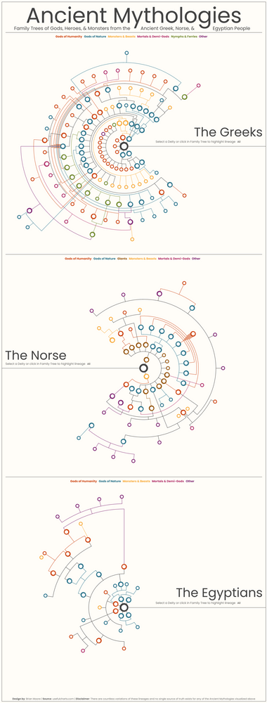
nRecently I shared a visualization mapping the family trees of three Ancient Mythologies (see below). This was one of the more complicated visualizations I have ever worked on, but a few people had asked how it was built, so I’m going to do my best explain the approach. Unlike some of the other tutorials I have written, this won’t be a step by step guide on how to build one of these from scratch, but instead, I’ll explain some of the techniques, provide a template, and go through detailed instructions on how to use that template to build your own. Here is the visualization I mentioned earlier.
The tree we are going to be building today is a little less complex than some of the ones represented above. We are going to build a family tree for the eight main Houses from Game of Thrones, using the tree found here as our base. When we’re finished, it should look something like this.
You can find all of the files needed to build this here. Start by downloading the following files.
- Family Tree Template.twbx
- Family_Data.xlsx
- Lineage.xlsx
Save all of the files locally, and then open up the Tableau Workbook (Family Tree Template). Edit the data source and edit both of the connections (Family Tree Data and Lineage) to point to your locally saved files.
I’ve also saved copies of the completed files you can use for reference (Family Tree Template_Complete.twbx and Family_Data_Complete.xlsx).
The Data Source
If you look at the Data Source in the Family Tree Template, you’ll see it’s made up of 5 Tables.
- Data: This is the main table. It is the Data sheet in the Family_Data Excel file. There are a number of calculated fields in that Sheet which we’ll discuss a little later on
- Densification: This is our densification table. It is the Densification sheet in the Family_Data Excel file. There are records for 7 different “Types”, that will allow us to create calculations for each element of chart and then combine them in the same view.
- Lineage: This file is used only for highlighting the lineages in the family tree. It is built using a Tableau Prep workflow and is stored as a separate file (Lineage.xlsx)
- Father: This is also the Data sheet from our Excel file. There is a self-join from the Father field in our main table to the Name field in the second instance of this table. This is done to bring in data about the location of the Parent nodes
- Mother: Same as above, but in this case the self-join is from the Mother field in our main table to the Name field in the third instance of this table.
For all of the fields coming from the Mother and Father tables, I have renamed the fields in the data source (ex. Column (Mother)), and hidden any fields that aren’t being used. We’ll talk more about each of the fields in our Data Source when we get to the section on filling out the template.
Elements of the Chart
As I mentioned earlier there are 7 “Types” in our densification table that represent 7 different elements of our chart.
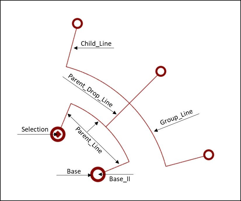
Shapes
- Base: This is just a colored circle, the base of each node. 1 record in the densification table
- Base_II: This is just a white circle, sized slightly smaller than the Base circle. 1 record in the densification table
- Selection: This is a colored diamond, sized slightly smaller than the Base_II circle to highlight which person is selected. 1 record in the densification table
Lines
- Parent_Line: This line is made up of 3 sections and is only present when a person has two known parents. There is a straight line coming from each of the parents and then a curved line connecting them. There are a total of 104 records in the densification table, 2 for each of the straight lines, and 100 for the curved line.
- Group_Line: This is a curved line that connects all of the nodes within a Group (a Group is a set of nodes with the same parents). There are 100 records in the densification table.
- Parent_Drop_Line: This is a straight line that connects the Parent_Line to the Group_Line. If there is no Parent_Line (only 1 known parent), then this is a straight line from the Parent node to the Group_Line. There are 2 records in the densification table.
- Child_Line: This is a straight line that connects the Group_Line to the Child node. There are 2 records in the densification table.
How it’s Built
I’m not going to go into too much detail here. The techniques I used were very similar to the ones used in previous tutorials. For each element of this chart, there are a separate set of calculations (grouped by Folder in the Tableau workbook). If you’re interested in learning more about these techniques, I would recommend checking out the 3-part series on this site titled “Fun with Curves in Tableau”, especially the 1st installment.
As I mention in that post, and many others on this site, to create any type of radial chart in Tableau, you really only need two inputs. For each point in your visualization, you need to calculate the distance from the center of the circle, and you need to calculate the position of the point around the circle (represented as a percentage from 0 to 100%).
So for each of these elements, I have built calculated fields to calculate the distance and position, and then I have plugged those results into the X and Y calculations to translate those values into coordinates that can be plotted on the chart. If you have questions about how any of these calculations work, please feel free to reach out to me on Twitter or LinkedIn and I’d be happy to talk through them.
Once all of those X and Y coordinates were calculated, I created 3 “Final” calculations that are used to combine all of the different chart elements together.
- Final_Y: This is a case statement that returns the value of the appropriate Y calculation for each element “Type”
- Final_X_Line: This is a case statement that returns the value of the appropriate X calculation for each of the Line elements
- Final_X_Mark: This is a case statement that returns the value of the appropriate X calculation for each of the Shape elements
Then I created a dual axis chart and set the Mark Type to Line for the Final_X_Line axis, and Shape for the Final_X_Mark axis, allowing me to combine the 3 shape elements and the 4 line elements all together in the same chart.
Using the Template
Just a quick warning, even with the template, this is still somewhat difficult to build. This is not a plug and play template and requires a fair amount of manual tweaking to make the chart work. Start by opening up the “Family_Data.xlsx” file and take a look at the different sheets. Updates need to be made to all 3 of the blue sheets to customize your chart.
Data sheet
This is the sheet that ultimately is used as the data source, but it pulls in data from the other 2 tabs and performs some calculations. The 5 black columns are where you enter your Family Tree data. The 3 blue columns need to be filled out for every record. The 10 red columns are calculations and should not be modified.
- Name: The name of the person
- NameID: A Unique Identifier for each person
- Group: The name of the group. A group is any set of persons who share the same parents. You can name the groups whatever you would like, but make sure it is the same for all persons in the group
- Mother: The Mother of the person. If the Mother is unknown but the Father is known, enter the Father’s name in this field. If both parents are unknown, enter the Name of the person again here. Do not leave blank
- Father: The Father of the person. If the Father is unknown but the Mother is known, enter the Mother’s name in this field. If both parents are unknown, enter the Name of the person again here. Do not leave blank
- Color: This can be whatever value you would like, but it will be used to assign color to the nodes and lines in your chart.
- Order: This is the Order of persons within a group. If there are 4 people in the same group, they should be numbered 1, 2, 3, and 4.
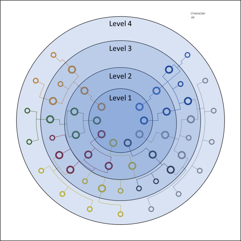
- Level: This is the level where the group will appear on the chart. If you look at the image below, you’ll see that the chart we are building has 4 Levels. The level value should be the same for all persons in the same group. Also, make sure that the level for each row is higher than the level for both of it’s parents. You can use columns I and J in the template to see the levels for each parent
Groups sheet
The next tab in the Excel file is for the Groups. Any group that is assigned in the Data sheet will also need to be added to the Groups sheet (1 record per Group). Similar to the Data sheet, you enter your data in the Black columns (the Groups), and then update the Blue columns. Do not edit/update any of the Red columns.
Order: This is the order of Groups within a level. If there are 5 Groups in the same level, these should be numbered 1, 2, 3, 4, and 5.
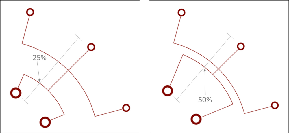
Parent_Line_Split: This should be a decimal value between 0 and 1 representing what percentage of the distance between the parent nodes and the child node do you want the Parent_Line to display. In example 1 below, this value is set to .25 so the Parent_Line appears 25% of the way from the Parent Nodes to the Child Nodes. In example 2 below, the value is set to .5, so the Parent_Line appears half way between the Parent Nodes and the Child Nodes. I like to use .3 as the default and then adjust if this line ends up overlapping with other lines.
Group_Line_Split: This is exactly like the Parent_Line_Split, but it determines where the Group_Line will be placed. I like to use .6 as the default and then adjust if the line overlaps with another Group.
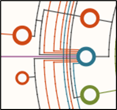
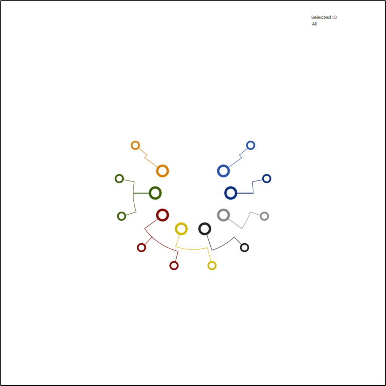
Offset_Mother/Offset_Father: These fields are only used if one of the Parents has multiple partners. You can use these fields to slightly offset the Parent_Lines coming from the Parent Nodes so they don’t overlap. If both Parents have only one partner, enter 0 in both of these fields. If just the Mother has multiple partners, enter a small value in the Offset_Mother field and a 0 in the Offset_Father field. You can use positive numbers to offset the lines one direction, and negative numbers to offset the lines in the other direction. You’ll want to enter very small values for these, somewhere between .001 and .01, and note that as the Level increases, the effect will increase, so the value in these fields should be smaller for higher levels. In my Ancient Mythologies viz, Zeus (the blue node) had 8 different partners, so these fields were used to offset those lines (see below)
Drop_Line_Offset: The last option in this sheet is to customize the position of the Parent_Drop_Line. This should be a value between -.5 and .5. By default, if you enter a value of 0, the line will be in the center, halfway between each of the parents. When you enter a value, that value is added to .5 to determine how far along the Parent_Line, the Parent_Drop_Line should be placed. In the example below, in the Red section, the value is 0, so the line is placed right in the center (0 +.5 = 50% of the way along the line). In the Blue section, the value is -.25 (-.25 + .5 = 25% of the way along the line). In the Orange section, the value is .5 (.5 + .5 = 100% of the way along the line).
Levels sheet
The last tab in the Excel sheet is for the Levels. Any Level that is assigned in the Data sheet needs to be added to the Levels Sheet. And, as was the case with the other tabs, you will enter your data in the black columns (Levels) and make your updates in the blue columns.
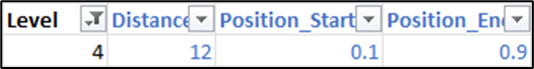
Distance: This is how far from the center of the circle that level will be plotted. Make sure that the values increase as the Levels go up
Position_Start/Position_End: These are used to set the range for the position of all nodes in that level. For example, in my Mythologies viz, I used .1 for the Position_Start and .9 for the Position_End. So each chart started at 10% (around the circle) and ended at 90%, resulting in that kind of Pac-Man shape. If you want the nodes to go all the way around the circle, use 0 and 1.
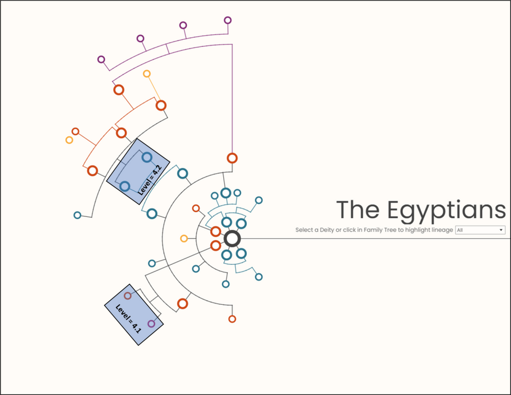
One other note about Levels. Each “Level” can contain sub-levels where you can set individual ranges (Position_Start/Position_End). In the example below, I only had 4 nodes (across 2 Groups) in Level 4 of the Egyptian family tree. If I put these Groups in the same Level they would have been evenly spread across whatever range I had entered. But by putting them in separate Sub-Levels, I was able to assign different ranges to each group and have better control over the placement.
Building Our Chart
Hopefully I haven’t lost you yet because we’re just getting to the fun part. Let’s get building! As you’re filling out the template, you can refer to the completed file in the Google Drive, titled “Family_Data_Complete.xlsx”
When I’m using this template, I like to build it one level at a time and make adjustments as necessary. So let’s start with Level 1.
Level 1
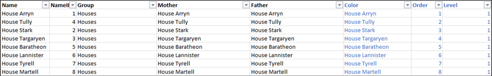
In this Tree, instead of using people for the 1st level, I’m going to use the name of each of the major Houses. So in the Data Sheet, I’m going to add 8 records, one for each House. I’m going to put them all in the same Group (Houses) and just enter the House Name in the Mother/Father fields since they don’t have Parents.. I’m going to assign each of them their own color in the Color field by using the House Name as well. For the Order, there are 8 records in this group, so I will number them 1 thru 8, and then assign them all to Level 1. The Data should look like this.
Next, in the Groups sheet, I will enter the new Group (Houses) in column A, set the Order to 1 since there is only 1 Group in this Level, and set the rest of the values to 0 (there will be no Parent or Group lines in this first Level because there are no Parents). The Groups sheet should look like this.

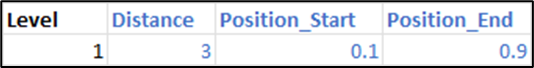
And finally, in the Levels sheet, I will enter my new Level (1) in column A, set the Distance to 3 (you can enter any number in here, but spacing each level by 2 to 3 seems to work pretty well) and I’m going to set my Position_Start to .1 and my Position_End to .9 to get that Pac-Man shape. The Levels data should look like this.
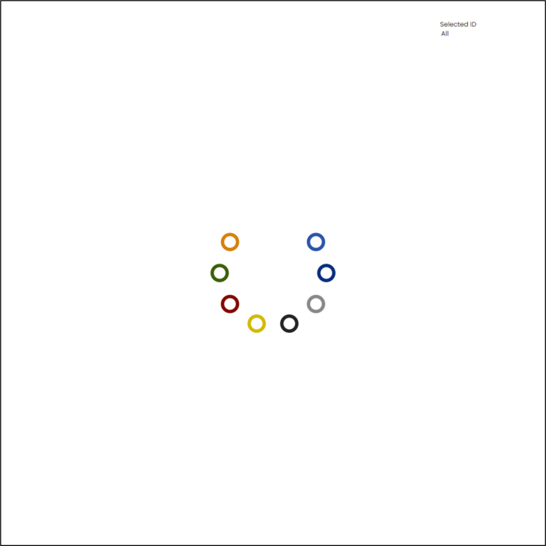
Now if we save our Excel file and refresh the Extract in our Tableau Workbook, we should have something like this.
Level 2
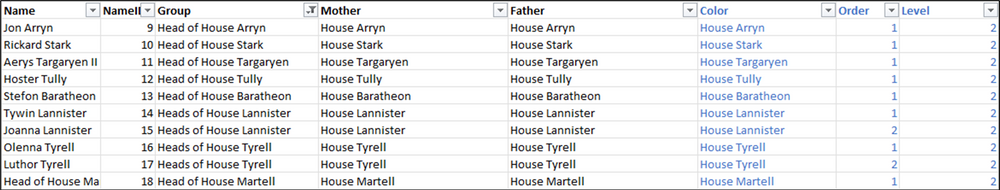
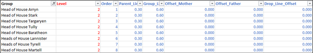
Next up, we have the Heads of each of the Major Houses. Looking at the Family Tree on UsefulCharts, we can see that there is one Head listed for 5 of the Houses, 2 Heads listed for 2 of the Houses (Lannister & Tyrell), and none listed for 1 of the Houses (Martell). We’ll just use an “Unknown” placeholder for House Martell. So our next Level will have 10 nodes.
We’ll enter the names of all of these Characters in Column A. In the Group column, we’ll enter “Head(s) of House….[Insert House Name]”. For Mother & Father, since we want our Level 1 nodes to connect to these new Level 2 nodes, we’ll use the House Names. For Color, once again we’ll use the House Name (we’ll use this on Color for every Level). For the Order, we’ll add a sequential number to each value in each Group. So Groups that only have 1 member, we’ll enter a 1. For Groups that have 2 members, we’ll enter a 1 for the first record and a 2 for the second record. And finally, we’ll assign a value of 2 for the Level for all of these nodes.
The Data sheet for these records should look like this.
Next, on the Groups sheet, we need to add our 8 new Groups in Column A. Since these Groups are all on the same Level, we’ll enter a sequential number in the Order column, 1 thru 8. For the Parent_Line_Split and Group_Line_Split, we’ll use my typical default values of .3 and .6 respectively, and then enter 0’s for the rest of the columns. The Groups sheet, should look like this for those records.
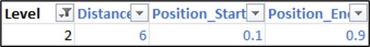
And finally, on the Levels sheet, we’ll add our new Level (2) to Column A. For the Distance for Level 2 we’ll use 6 (adding 3 to the Distance from Level 1), and we’ll use the same Position_Start/Position_End values. The Levels tab should look like this for Level 2.
Now, if we save our Excel file and refresh our extract, it should look something like this.
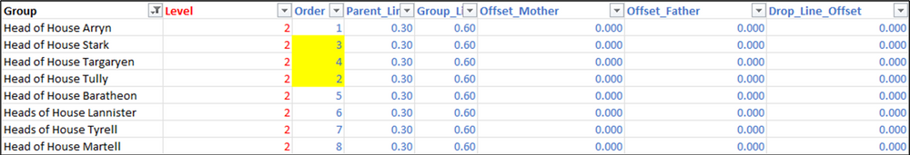
Now you may notice a few issues with our work so far.
First, it appears as if the 2nd Level is out of Order. Notice in Level 1, we have House Arryn (light blue), then House Tully (dark blue), then House Stark (grey), then House Targaryen (black). But in the 2nd Level, it goes Arryn/Stark/Targaryen/Tully. So let’s adjust the Order in our Groups sheet so that the Level 2 nodes line up better with the Level 1 nodes.
I’ve adjusted the Order field to match the Order of the Houses.
Now save and refresh the extract.

That’s better, but there is still an issue. Look at the Group_Lines for House Baratheon (yellow) and House Lannister (red). They are overlapping. So let’s use our Group_Line_Split field to fix that. In the row for “Head of House Baratheon”, let’s change that from a .6 to a .5 to bring that line inward a bit.
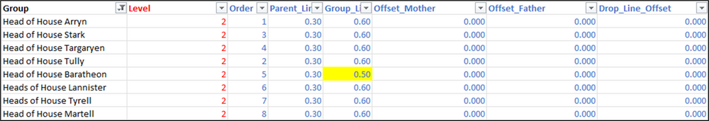
If I save the file and refresh the extract, we can see that that Group Line has shifted inwards and is no longer overlapping.
Level 3
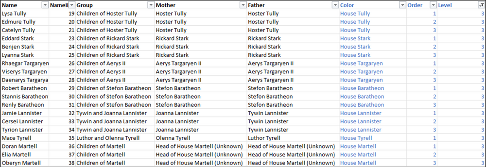
Next up, we have 3 children for Hoster Tully, 3 children for Rickard Stark, 3 children for Aerys Targaryen II, 3 children for Stefon Baratheon, 3 children for Tywin and Joanna Lannister, 1 child for Luthor and Olenna Tyrell, and 3 Children of the Unknown Head of House Martell. So let’s add all of those to Column A in our Data sheet. Each of these groups of children will be their own Group in the Group column, and we’ll add the Mother and Father names to those columns. Remember, if only one parent is known, enter that name in both the Mother and Father column. Again we’ll use the House Name for the Color. For the Order, number each accordingly within each group (1 thru 3 for groups with 3 children, 1 for groups with 1 child). And then assign Level 3 to all of these records. The Data sheet for Level 3 should look like this.
If you are looking at the Family Tree on UsefulCharts, you may have noticed that there is a child for Jon Arryn. However, the mother of this child is going to be in Level 3, so instead of adding them here, we’ll add that child to the next level, Level 4.
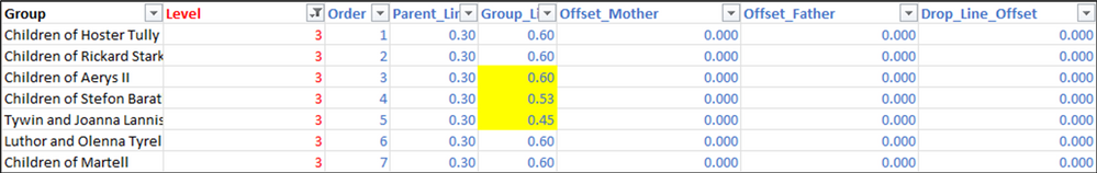
Next, we’ll add each of our new Groups to the Groups sheet in Column A. Then, we’ll set the order so it aligns with the previous levels. Finally, we’ll use our default values of .3 and .6 for the Parent_Line_Split and Group_Line_Split and set the other 3 columns to 0. The data in this tab for Level 3, should look like this.
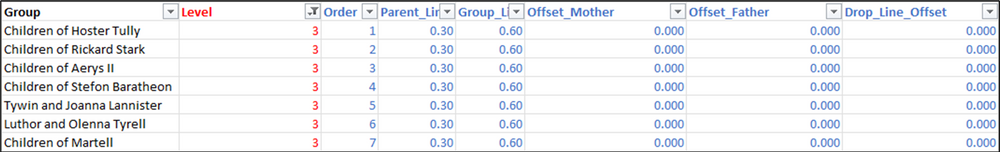
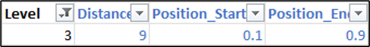
And finally, we’ll add Level 3 to our Levels sheet with a distance of 9 and the same Position_Start/Position_End values as our previous levels. The Levels sheet should look like this for Level 3.
Once you save the Excel file and refresh the extract, the Tree should look like this.
Once again we have some overlap between House Baratheon (yellow) and House Lannister (red). And the lines for House Baratheon and House Targaryen (black) are extremely close. So let’s make some edits to fix both of these. I want to make these so they kind of cascade as they go around the circle, so I’ll keep the Group_Line_Split as it is, at .6 for House Targaryen (in the row for Group = Children of Aerys II), then for House Baratheon, I’ll reduce it slightly to .525 (in the row for Group = Children of Stefon Baratheon), and then reduce it slightly more for House Lannister to .45 (in the row for Group = Tywin and Joanna Lannister).
The revised data in the Groups sheet should look like this.
And now, when I save the file and refresh the extract, there is a little extra room for each of these lines.

Level 4
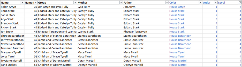
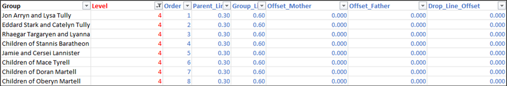
In our final level, we have 1 child for Jon Arryn and Lysa Tully, 5 children for Eddard Stark and Catelyn Tully, 1 child for Rhaegar Targaryen and Lyanna Stark, 3 children for Jamie and Cersei Lannister, 2 children for Mace Tyrell, and 1 child each for Doran and Oberyn Martell. We’ll add all of these names to column A in our Data sheet, assign an appropriate group, update the Mother and Father, and enter the House name in the Color field. Notice that for the children of Jamie and Cersei Lannister, I assigned House Baratheon, as they were raised as Baratheons. Then assign sequential numbers for each group in the Order field, and assign Level 4 to all of these records.
The data for level 4 in the Data sheet should look like this.
Then update the Groups and Level sheets the same as we had done for the previous levels. The data in those tabs should look like this when you’re finished.
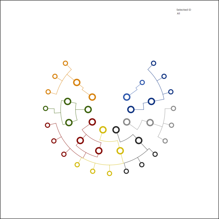
Save and refresh and your Tree should look like this.

It’s difficult to notice at first glance, but we do have one instance of overlapping lines here. In the Stark section (grey) there are actually 2 groups here. The first 5 are children of Eddard Stark and Catelyn Tully. The last one is Jon snow, child of Rhaegar Targaryen and Lyanna Stark, but raised as a Stark. So I’m going to update the Group_Line_Split for the row for Rhaegar Targaryen and Lyanna Stark, and set that to .5 instead of .6. And we’re done!!! Almost.

You could stop here, but one of the elements of the visualization I had created, which I think is really important, is the ability to highlight the lineage of any member of the tree, either by clicking on the node, or by selecting it in the parameter. This template already has that functionality built in, but in order for it to work, you need to update the Lineage.xlsx file.
Updating the Lineage File
The Lineage file has 3 key fields: a concatenated list of all ancestors (parents/grandparents/great-grandparents and so-on), a concatenated list of all spouses or co-parents, and a concatenated list of children. To update this file, start by downloading and opening the Lineage_Builder.tfl file.
First, edit the connection for the “Data” input so that it points to the Data sheet in your local copy of the Family_Data.xlsx file. Then, edit the Output step so it points to your locally saved copy of the Lineage.xlsx file
When running this workflow with new data you will most likely need to make some modifications to the flow. A lot of the steps in this flow rely on pivoting the data, assigning ranks, and then creating crosstabs with those rank values as the headers. Because those ranks will be dynamic depending on your data, you will need to modify some of the calculations. Also, depending on how many generations you are trying to map, you may need to add a few calculations to the first branch of the flow. So let’s go through all of that now. In the flow, you’ll notice there are 3 branches, one for each of our 3 lineage fields.
1st Branch – Parents
This branch of the flow is set up to support up to 6 generations. If your data has less than that (you should be able to tell from the number of levels you used), you do not need to make any major changes to the flow outside of a few calculations and you can skip ahead to the Modifying Calculations section below. If your data has more than 6 levels, you’ll need to add a few steps.
ADDING LEVELS
If you look at the first Group in this flow, you’ll notice that the steps repeat.
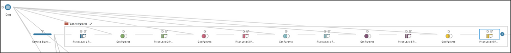
The first step pivots the Mother and Father columns so there is a row for each instead of a column for each. Then we rename the field “Level_1_Parent”.
The second step joins that “Level_1_Parent” field back to our Data sheet to get those people’s parents. We remove the extra Name and NameID fields and then we repeat the process.
The third step once again pivots the Mother and Father columns, and this time we rename that field “Level_2_Parent”.
Then we join back to the data again to get those people’s parents. And on and on it goes. If you need to add a Level 7, follow the steps below.
- From the last step in the first box, Pivot Level 6 Parents, add a join. This should be a Left join from that step, to the Data input
- Remove the extra Name and NameID fields
- From the Join step, add a Pivot step
- Add the Mother and Father fields to the Pivot Values column
- Remove the Pivot Names field
- Rename the Pivot Values to “Level_7_Parent”
- Repeat for any additional levels
- In the first step in the second Group (Create Lineage) named Pivot All Parents, add any new levels to the Pivot Values column
MODIFYING CALCULATIONS
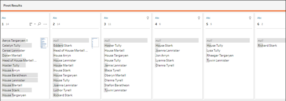
The steps in the “Create Lineage” group will pivot all of the parents/grandparents/great-grandparents and so on and then remove duplicates. It will then assign a sequential number to each of these ancestors. So if person 1 has 10 ancestors, there will be 10 rows, numbered 1 thru 10. For person 2, the numbering will start over at 1. Then the flow creates a crosstab of this data, so there is now a column for each of those numbers. In this sample data, we only have 6 columns (named 1, 2, 3,…)
The last step in this branch of the flow just combines all of these numbered fields into a single, pipe-delimited, concatenated field. Check to see how many numbered fields you have, and then edit the “Lineage_Parent” calculation accordingly.
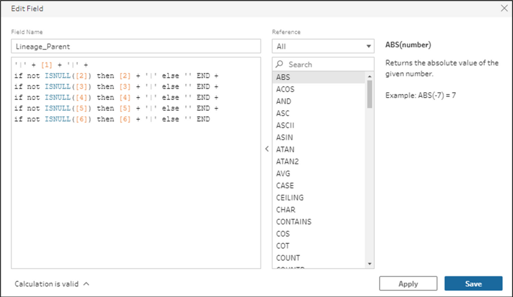
For example, if your flow has 10 of these columns, you’ll need to add an additional 4 rows to this calculation (one row for [7], one row for [8], and so on). In this same step of the flow, you’ll also want to remove all of those numeric columns. The version as is removes 1 thru 6, but if there are additional columns, you’ll want to remove those as well.
2nd & 3rd Branches
In these branches, you do not need to add any steps, no matter how many children or partners any of the people in your data have had. You will, however, have to update the last step in both of these branches, the same way we did for the 1st Branch.
MODIFYING CALCULATIONS
In the 2nd branch of the flow, go to the 2nd to last step, labelled “Crosstab”, check to see how many number columns were created. In our sample data, there was only 1, but if any of the people in your data had children with multiple partners, there may be additional columns. Go to the last step in the 2nd branch, labelled “Create Strings” and modify the “Lineage_Spouse” calculation the same way we did for the 1st Branch. To make this a little easier, I’ve left up to 6 rows in the calculation and commented them out. You can just remove the // from the start of any line to include that row in your calculation. In this step of the flow, you’ll also want to remove any of the extra number columns.
Repeat all of these steps for the 3rd branch of the flow to get a concatenated list of children.
Other Notes
So that’s pretty much it. Just a few other quick things I want to mention before we wrap it up.
There is a parameter called “Rotation”. You can use this to rotate your viz. In my original Mythologies viz, you’ll notice the first Tree has the opening to the right, the second Tree has the opening to the left, and the third Tree has the opening to the right again. For the first and third, I set this parameter to .25, which rotates the viz 1/4 of the way around, or 25%. For the second, I set this parameter to .75, rotating the Tree 75%.
There is also a parameter called “Thickness”. You can use this to make the white circles (Base_II), larger or smaller. The higher the value, the thicker the colored rings will appear (white circles will shrink). The lower the value, the thinner the colored rings will appear (white circles will grow).
And lastly, you may notice that there are 2 filters applied. If you remove these filters, you may not notice any changes to the chart in Desktop, but it may result in some weird behavior once published to Tableau Public. For some reason, Tableau Public seems to have an issue trying to render identical marks that are stacked on top of each other. Lines end up thicker then they should, and other mark types sometimes get fuzzy and weird. There also seems to be an issue when there are too many points plotted too closely together.
The “Extra_Point_Filter” limits the number of points that are used in all of the curved lines. Remember there are 100 points in our Densification table dedicated to these lines, but sometimes the lines end up being very short. This filter basically allows all 100 points to be used for the longest line, compares the length of all other lines to that longest line, and uses the appropriate number of points (ex. if a line is half as long as the longest line, only 50 points will be used instead of 100)
The “Extra Lines Filter” removes extra Parent and Group Lines. The way this is set up, it will draw these lines for every node, so if there are 5 nodes in a Group, 5 identical lines will be drawn and “stacked” on top of each other. This calculation removes all of those extra lines.
There are also 2 Dashboard Actions set up in the template. One is just to remove the default highlighting when you click on a node. You can read more about that technique here. The second is a Parameter Action to save the selection when a node is clicked. Clicking the same node again will remove that selection.
I think that’s about it. If you made it to the end of this post, and have had a chance to test out this process, please let us know. As always, we would love to see what you were able to create with it!